Alfaiataria Lusa
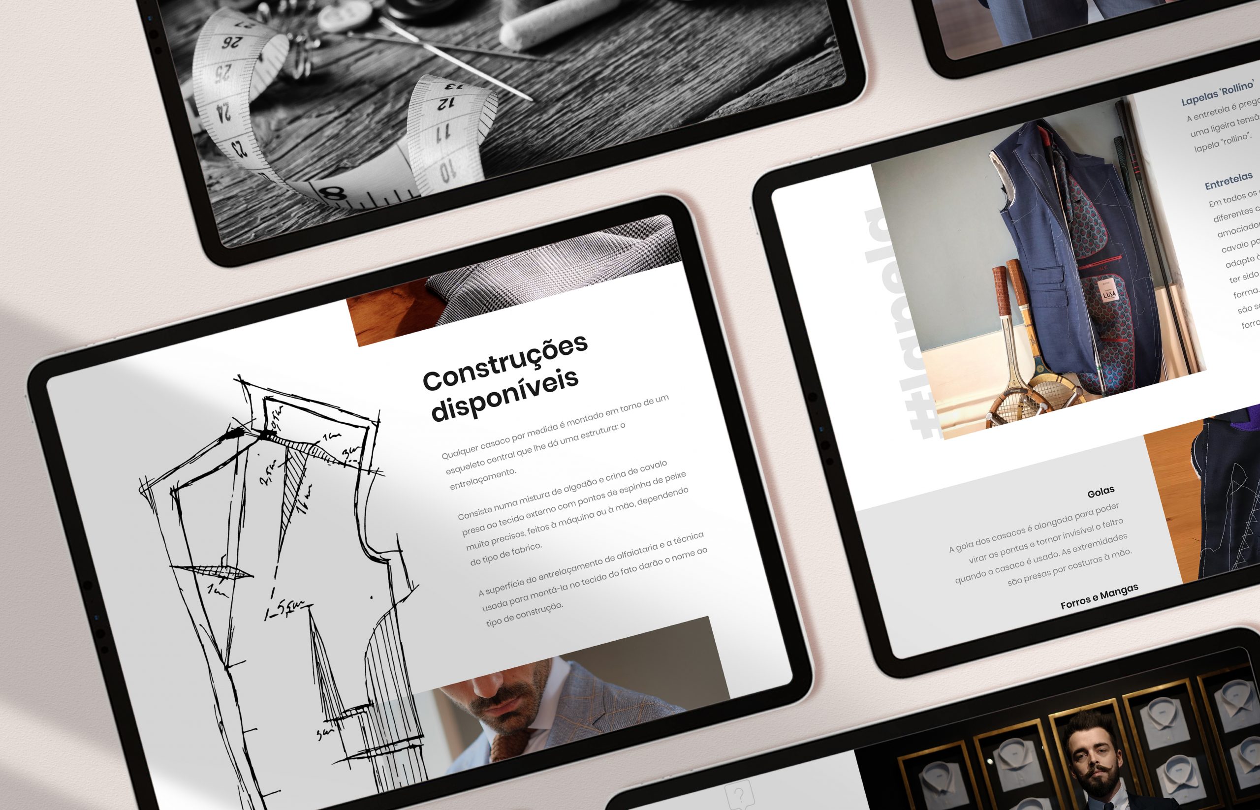
This website was developed for the tailoring company Alfaiataria Lusa. We created a modern and clean layout, combined with watercolour and pen illustrations and overlapped shapes and thin lines turning the users visit more interesting and appealing.
Our inspiration came from the leaflet that we created using lines and overlapped photographs and illustrations. We wanted to maintain the consistency between all company’s promotional materials, by adapting the editorial design to the website design. This way we also show that the design results on paper and even on a computer screen and it can be evolved and applied to other kind of materials.
The website structure has pages thought for different needs and allows the user to explore the services and the concept of the company. We adapted the design to different devices allowing the users to navigate easily through the website, always keeping the classic touch of the brand and the concept of tailoring business.