Artâmega
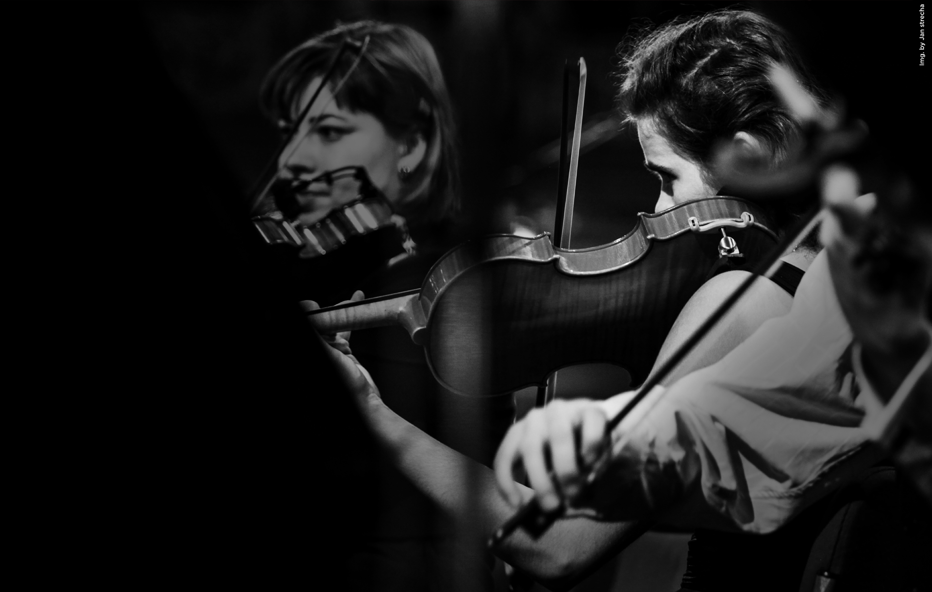
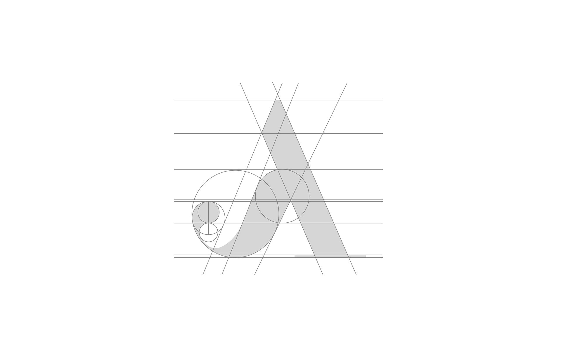
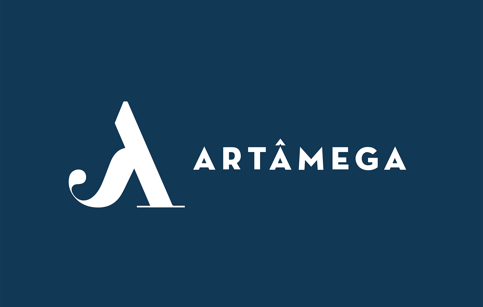
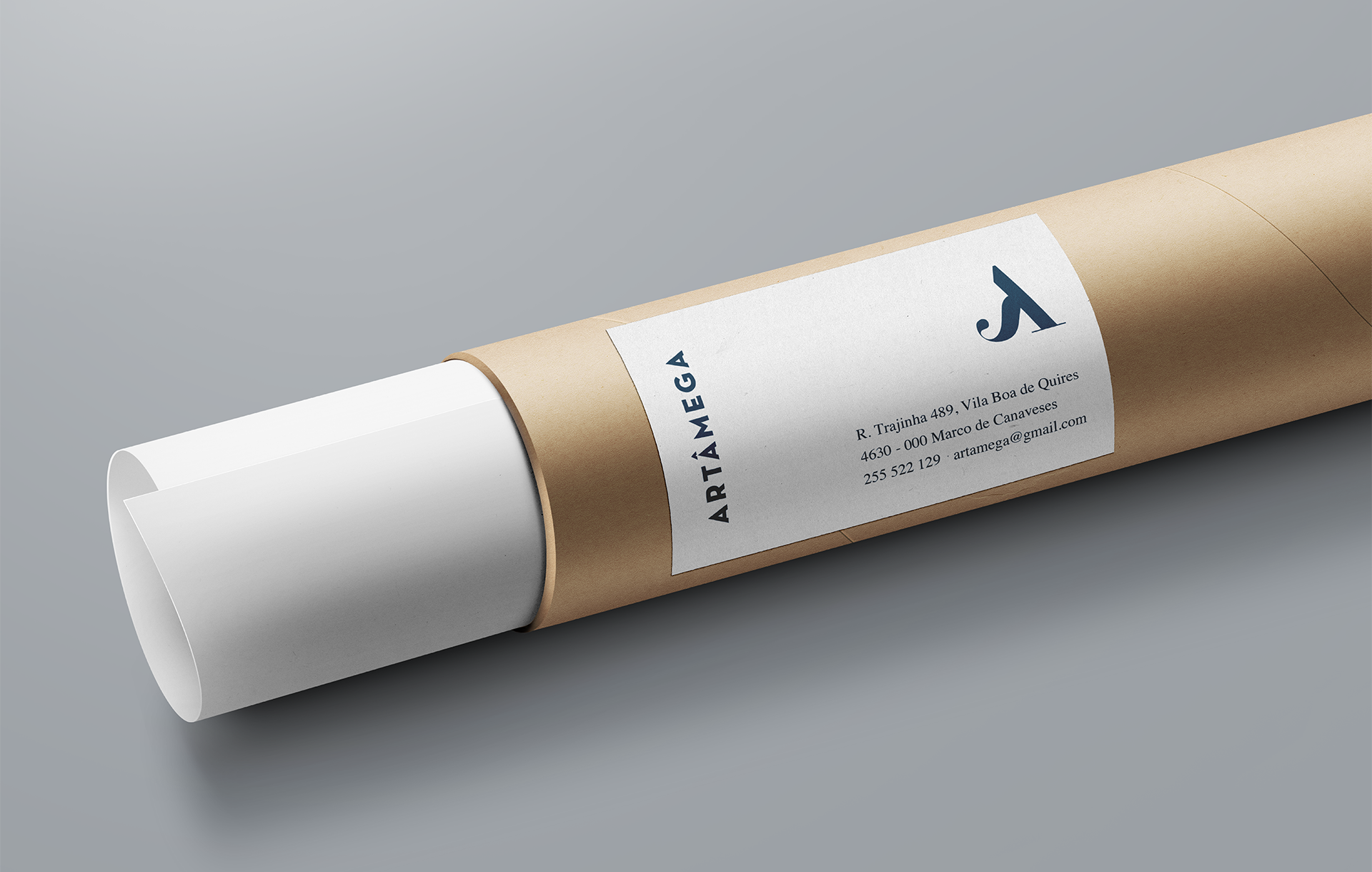
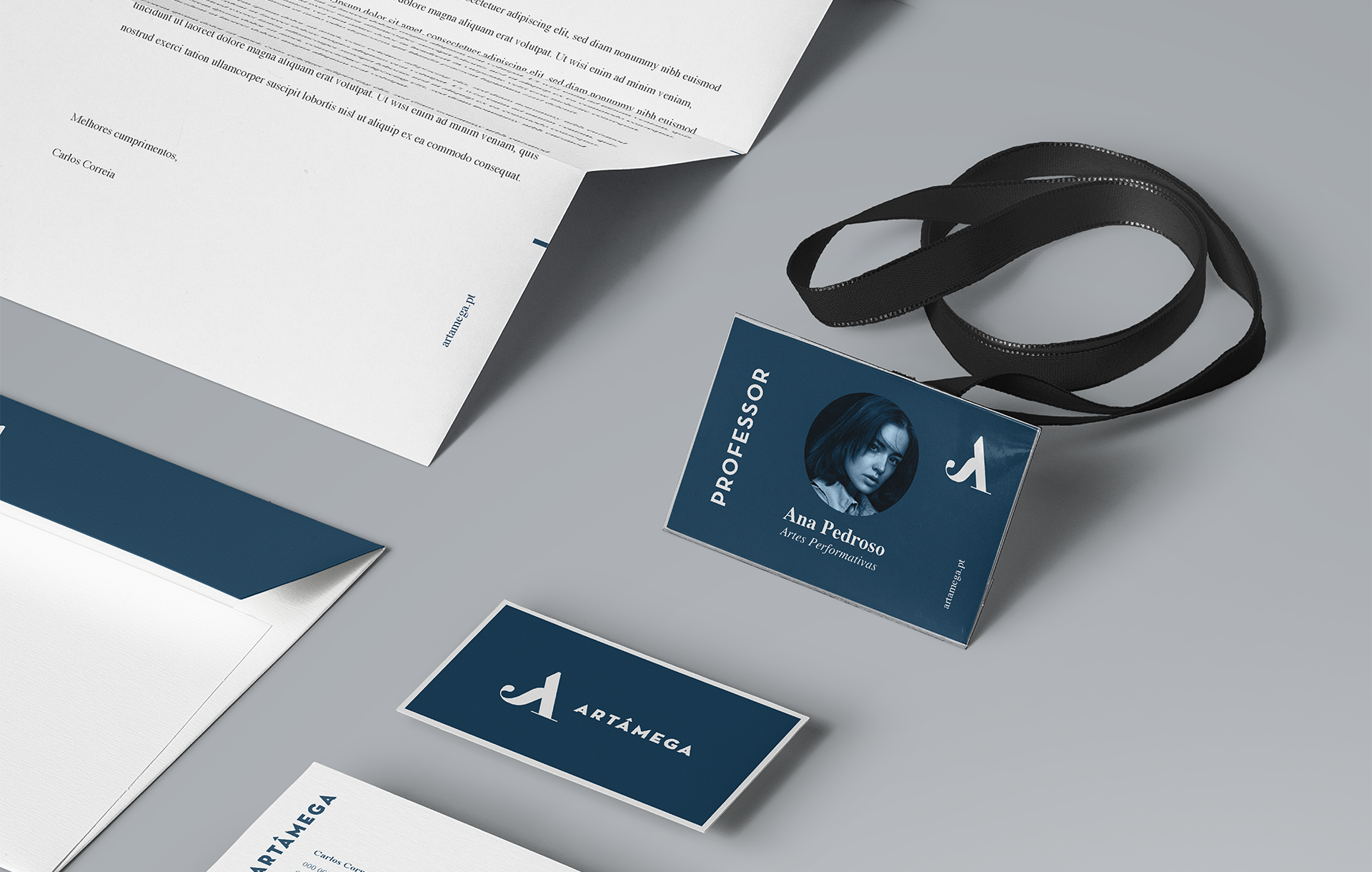
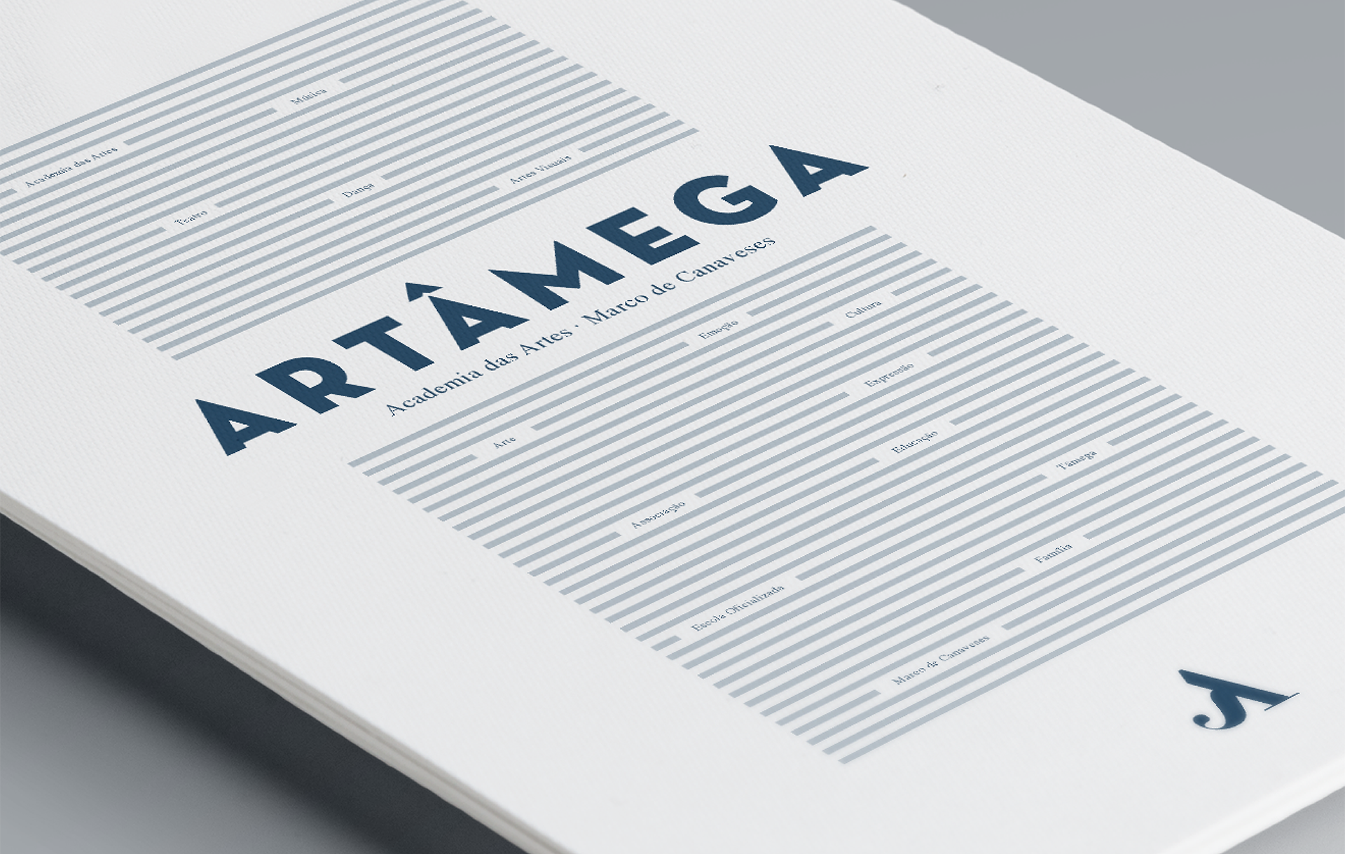
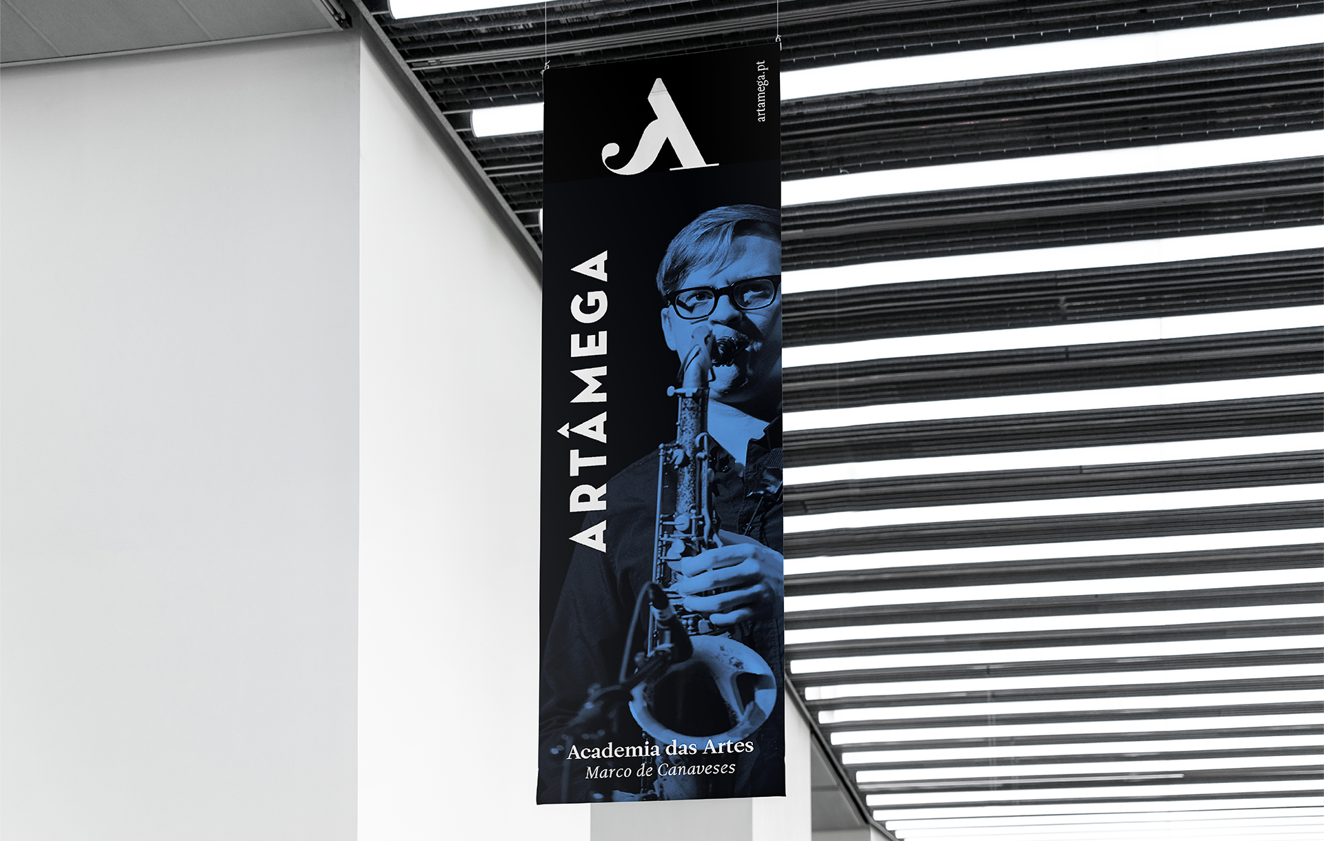
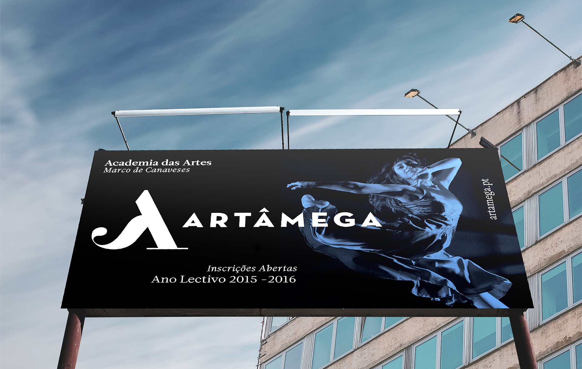
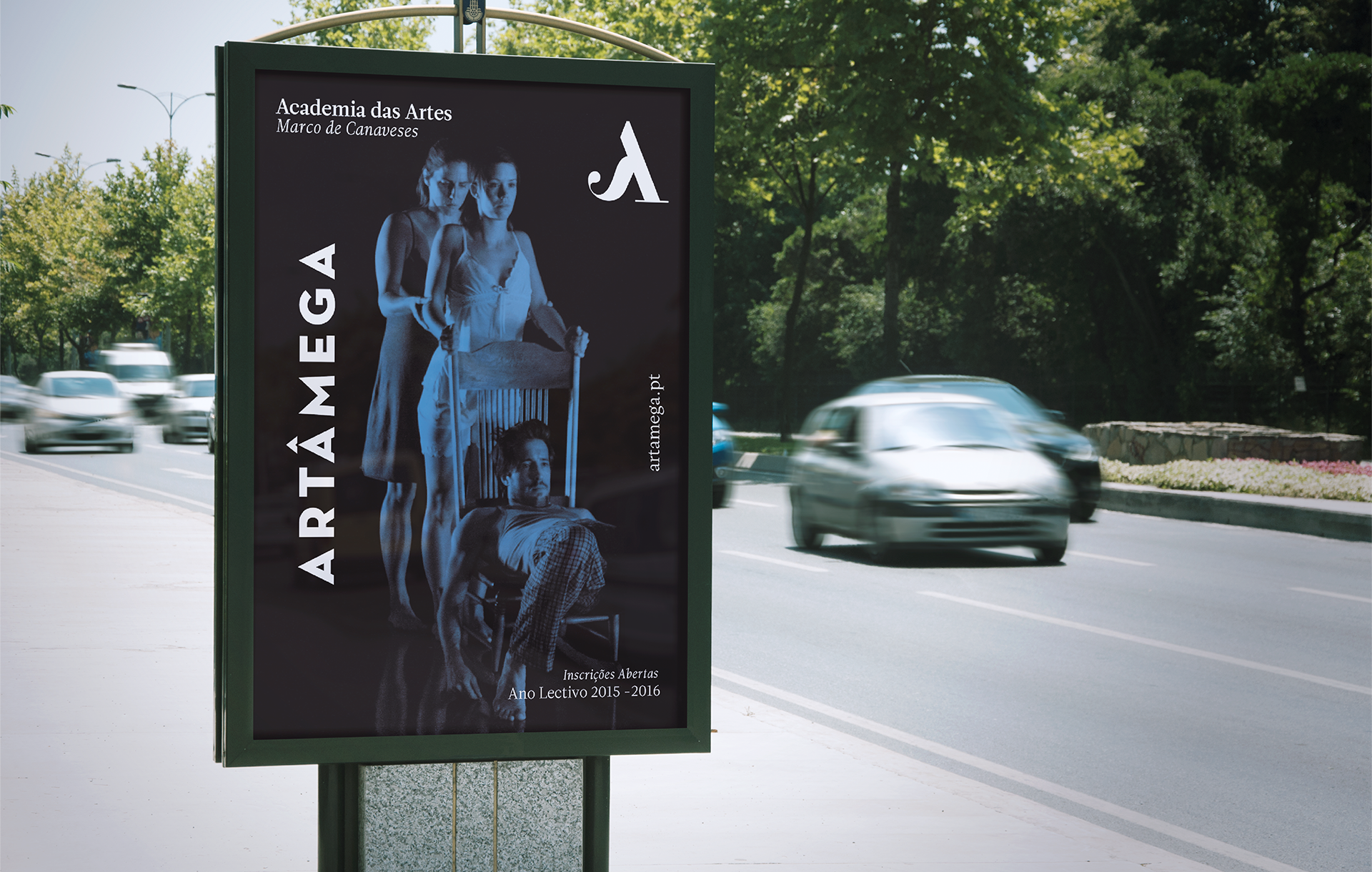
Artâmega art academy was founded in 2009. Its a school where music, theatre and dance gain life. The brand identity was inspired on the silhouette of musical notes, with serifed, elegant and grotesque typographies.
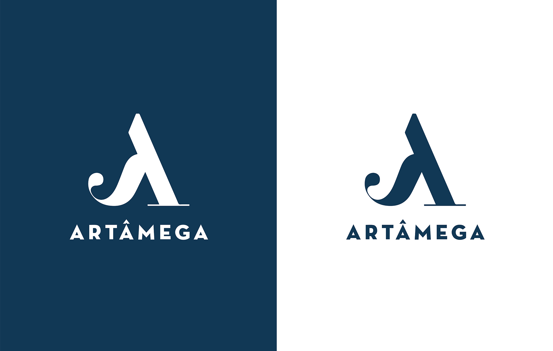
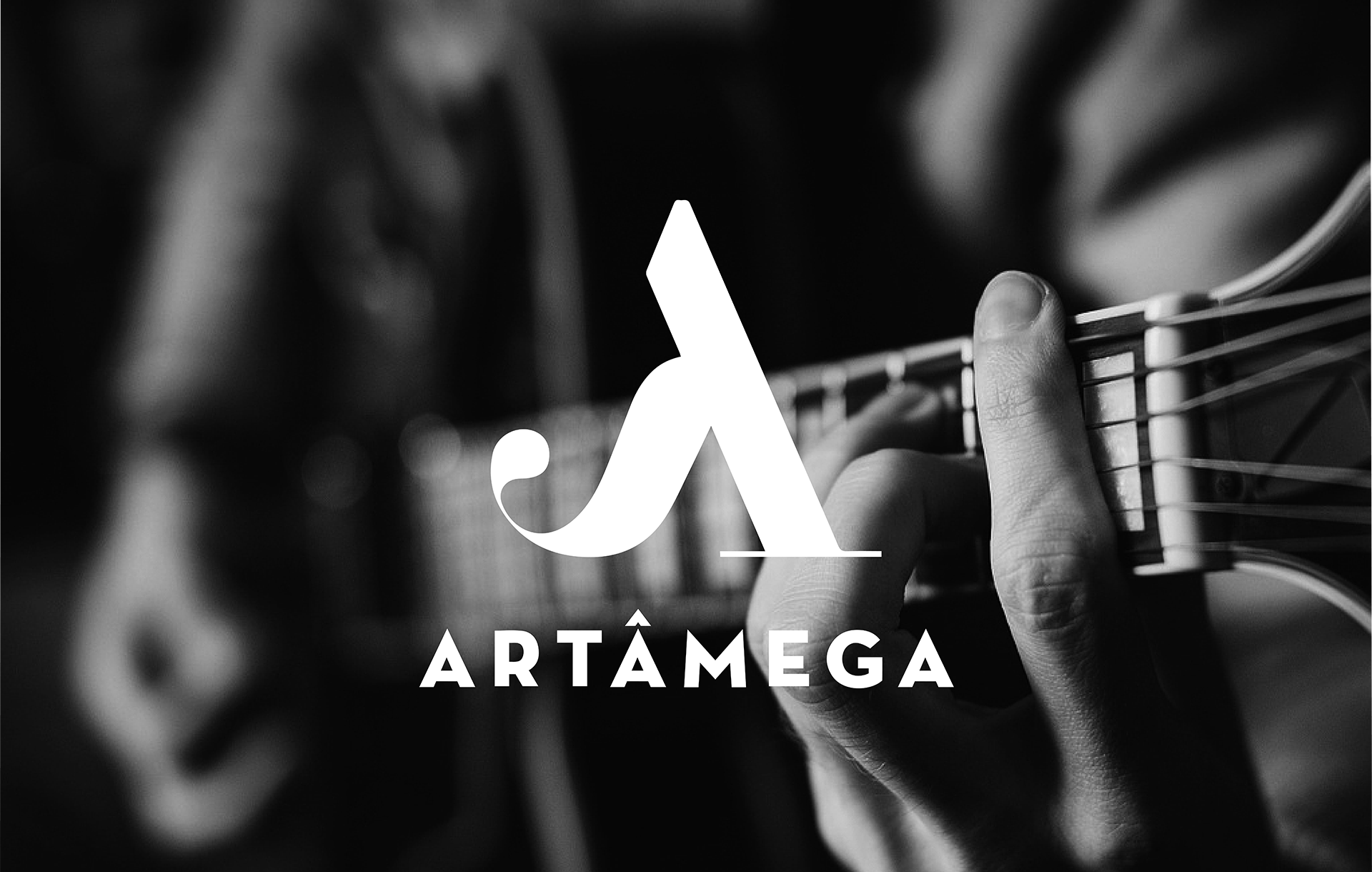
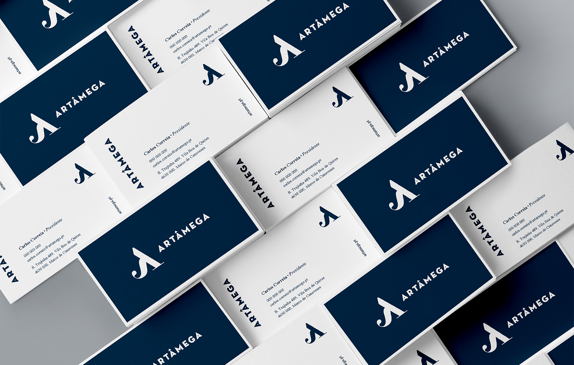
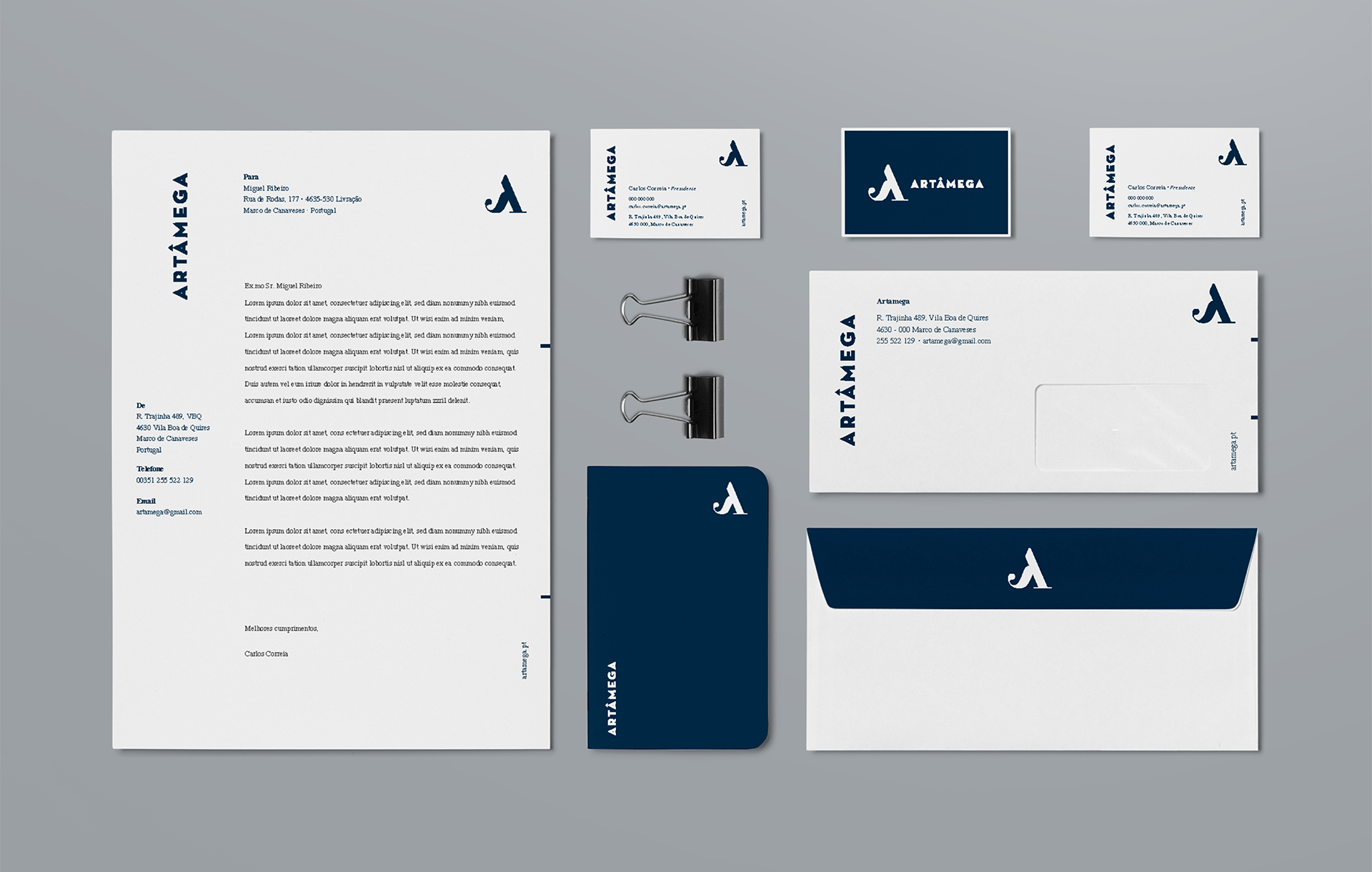
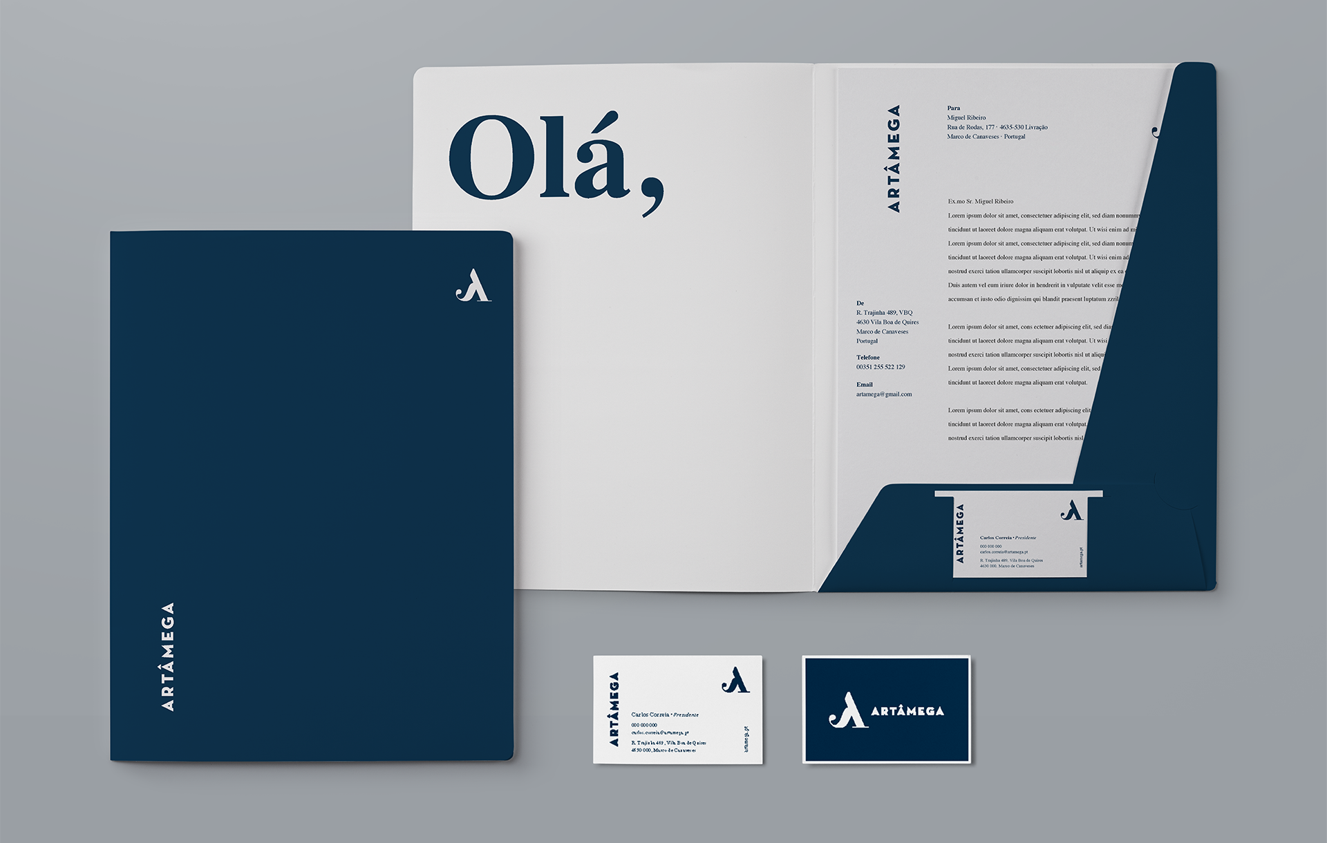
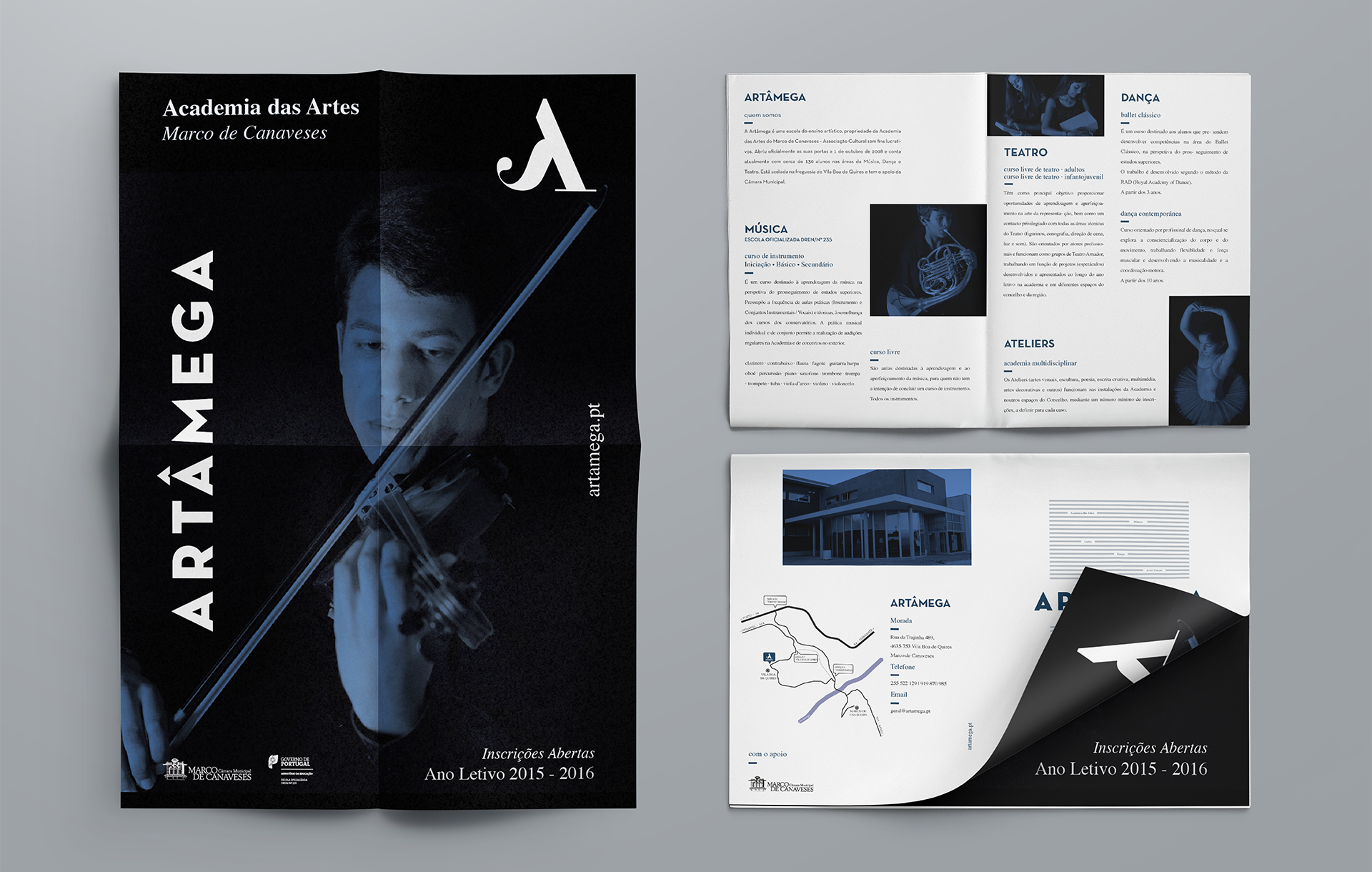
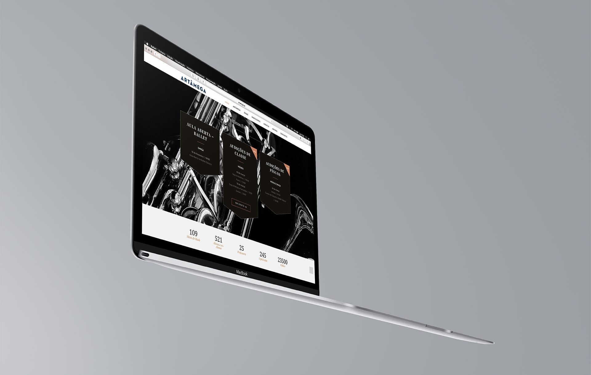
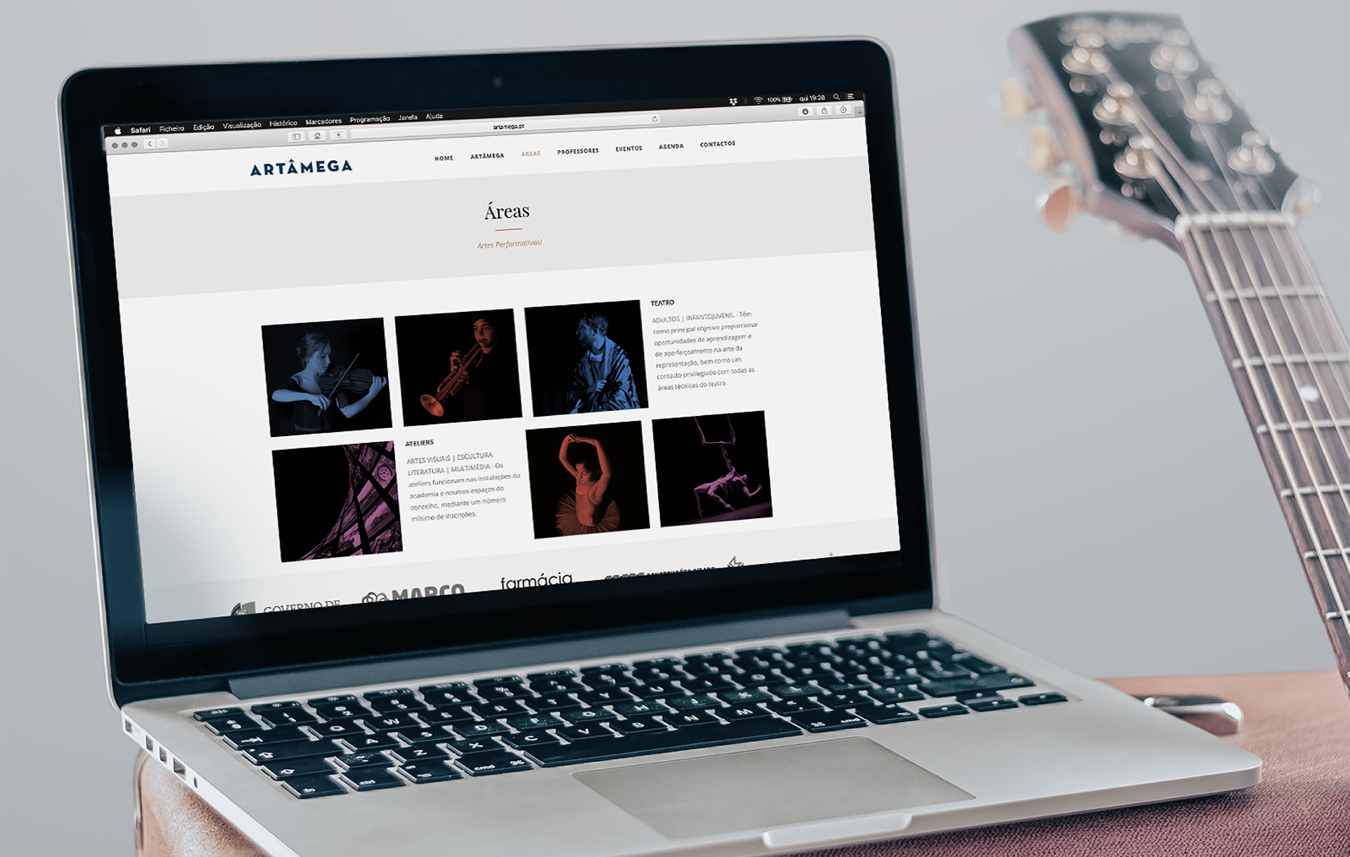
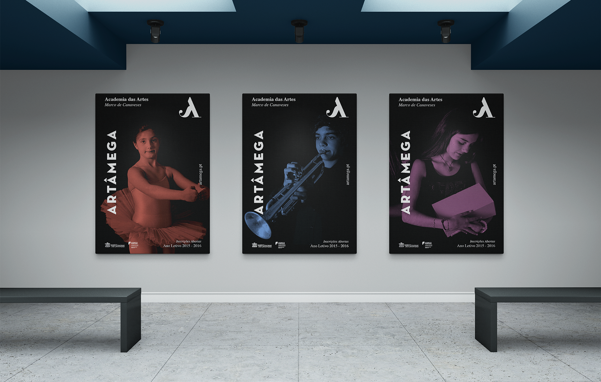
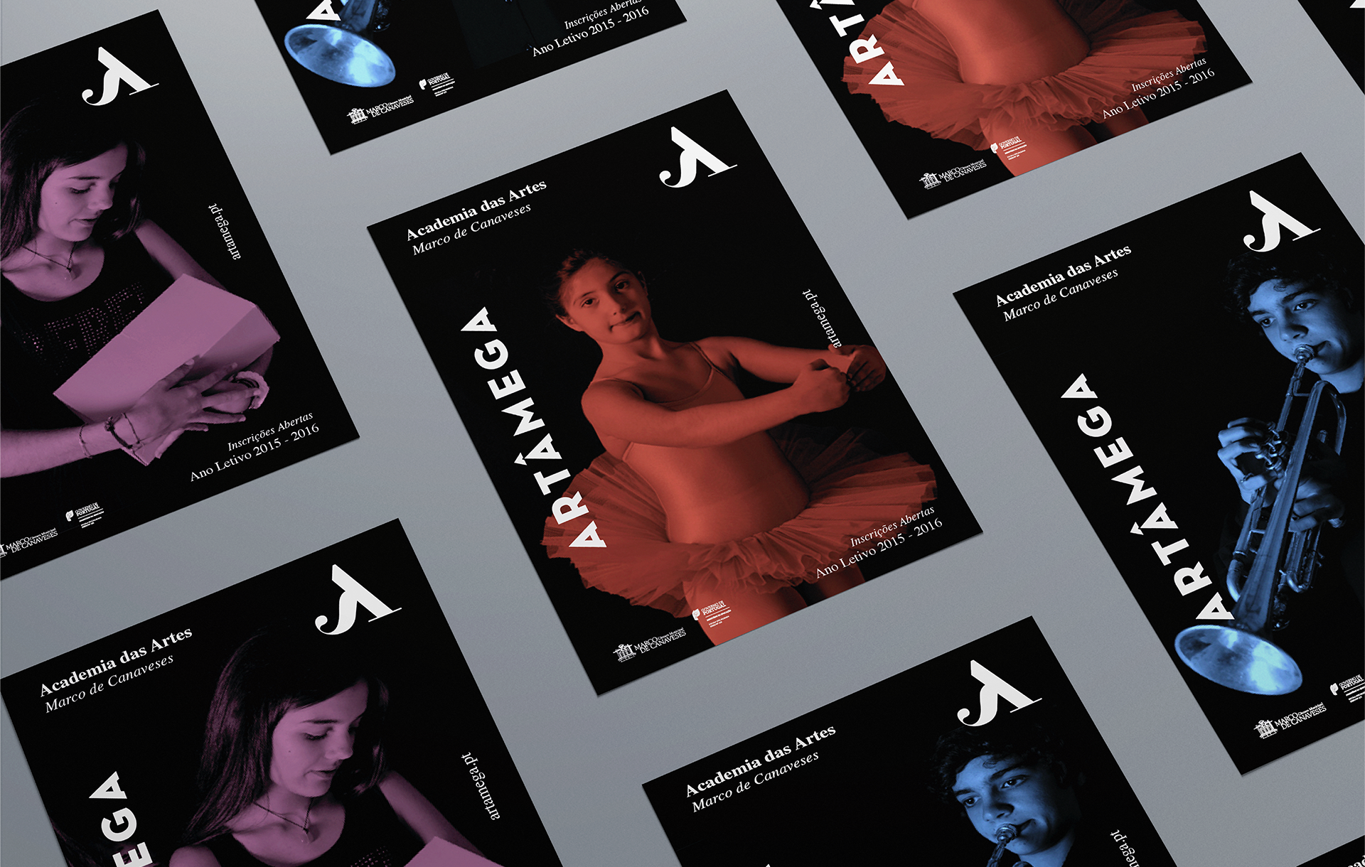
The logo, resulted in a beautiful symbol with curvy lines and different thicknesses and a bold, non-serif typography. The dark blue color gives the brand a serenity that exudes quality, and leaves space for shadows and stage lights to manifest. Following the branding, we created some posters and outdoors to promote the academy and its subject areas. And thereafter, we developed the school website displaying a dynamic layout with changing images and videos, with the collaboration of Miguel Ribeiro.
The logo, resulted in a beautiful symbol with curvy lines and different thicknesses and a bold, non-serif typography. The dark blue color gives the brand a serenity that exudes quality, and leaves space for shadows and stage lights to manifest. Following the branding, we created some posters and outdoors to promote the academy and its subject areas. And thereafter, we developed the school website displaying a dynamic layout with changing images and videos, with the collaboration of Miguel Ribeiro.