Marco City
The rebranding of Marco de Canaveses township was a challenge presented to us as a need to fortify/reinforce its visual presence. We started by analysing the elements that represent this place and the local residents, and also how the people usually refer to it verbally.
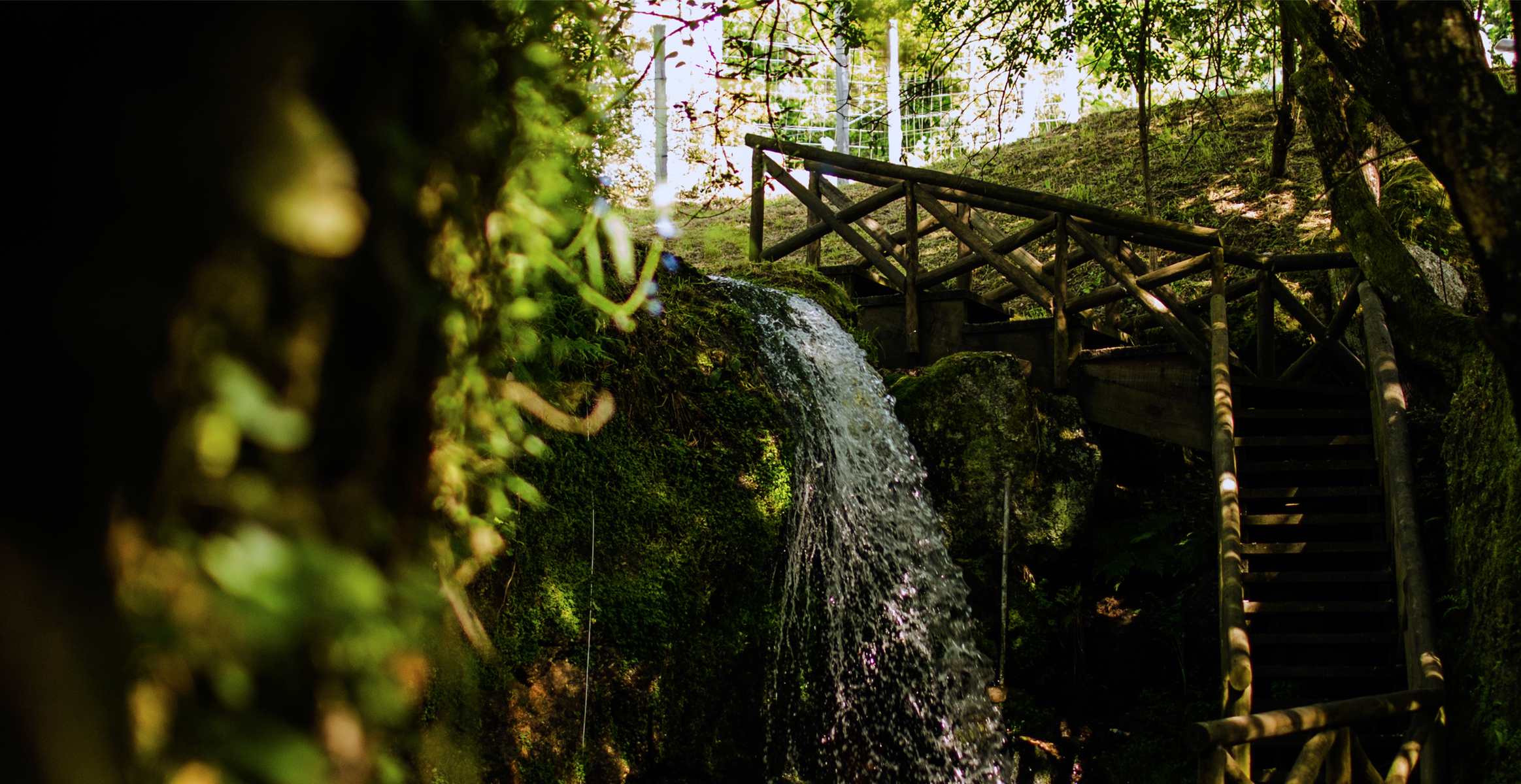
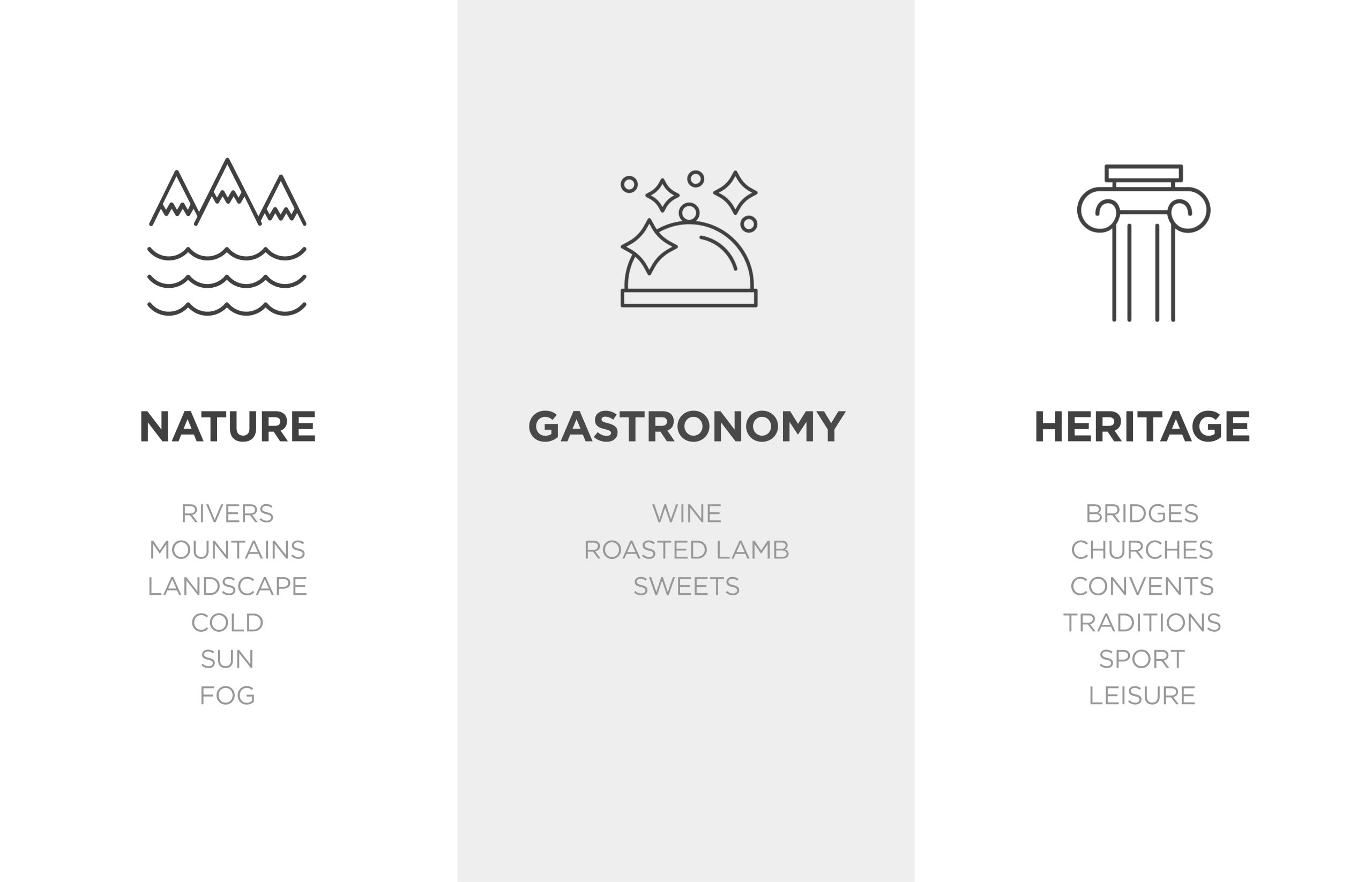
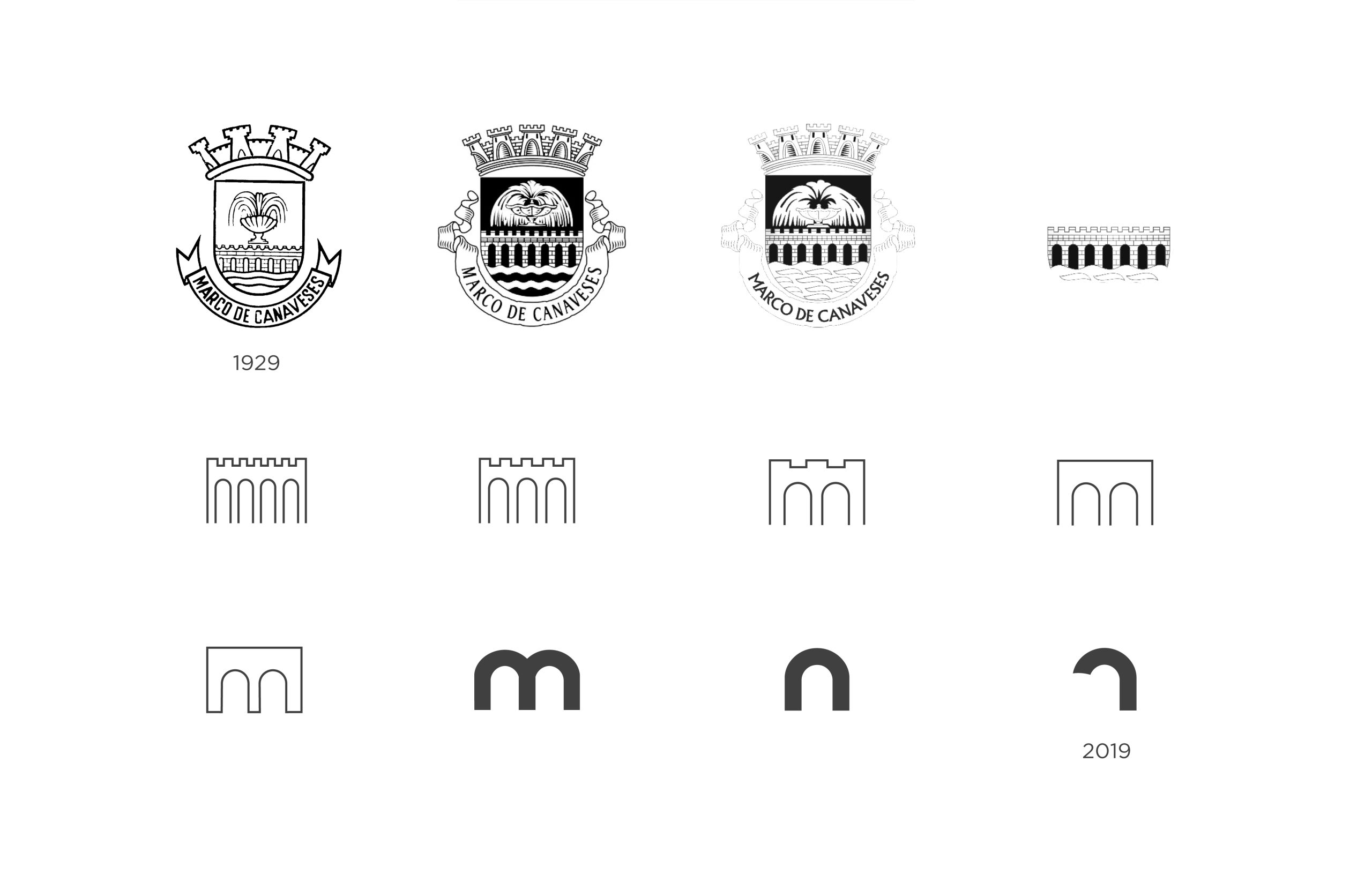
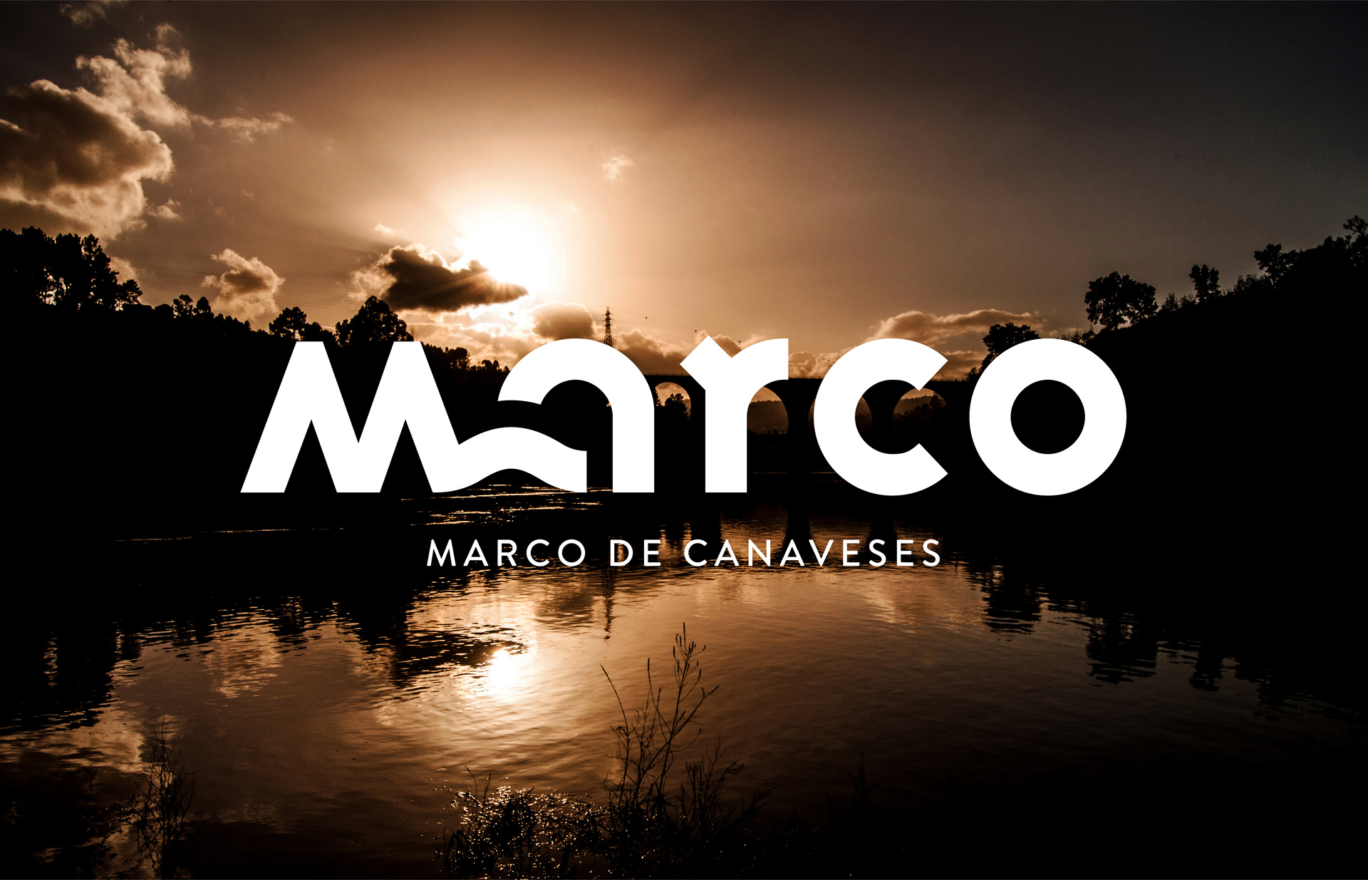
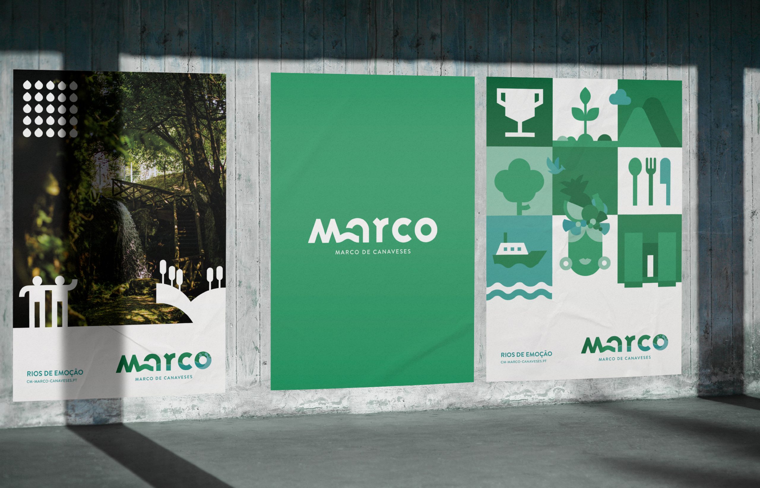
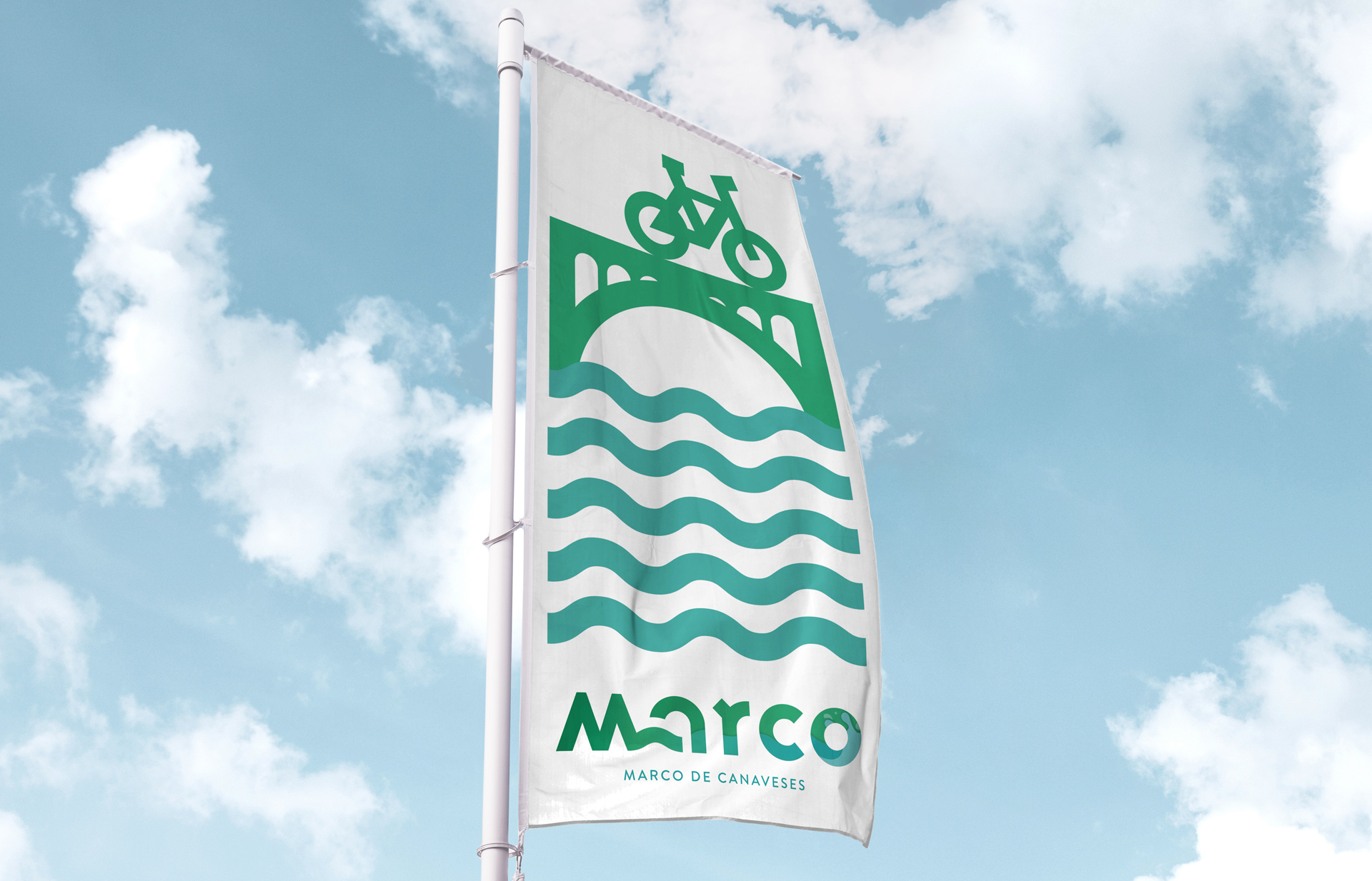
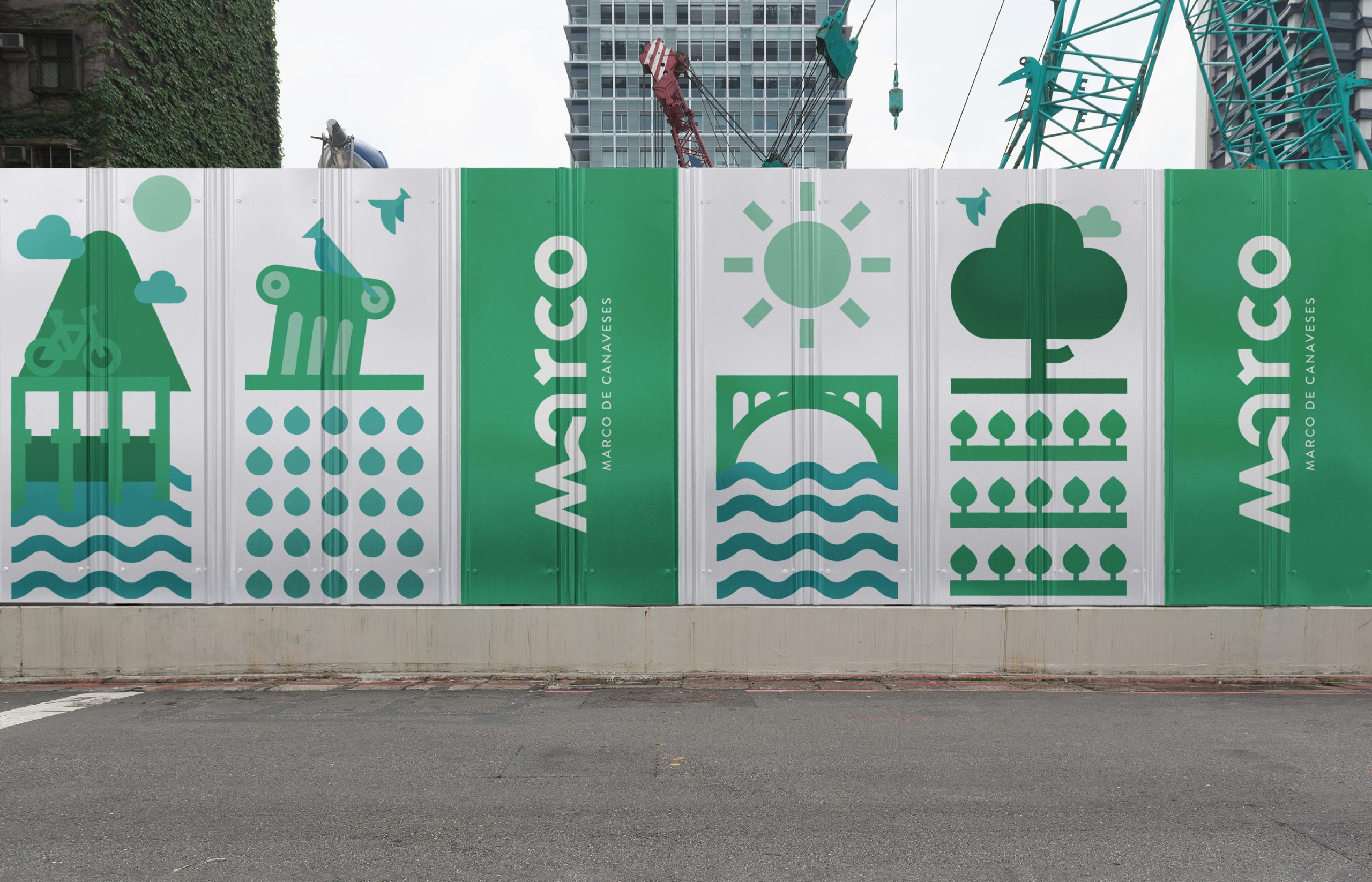
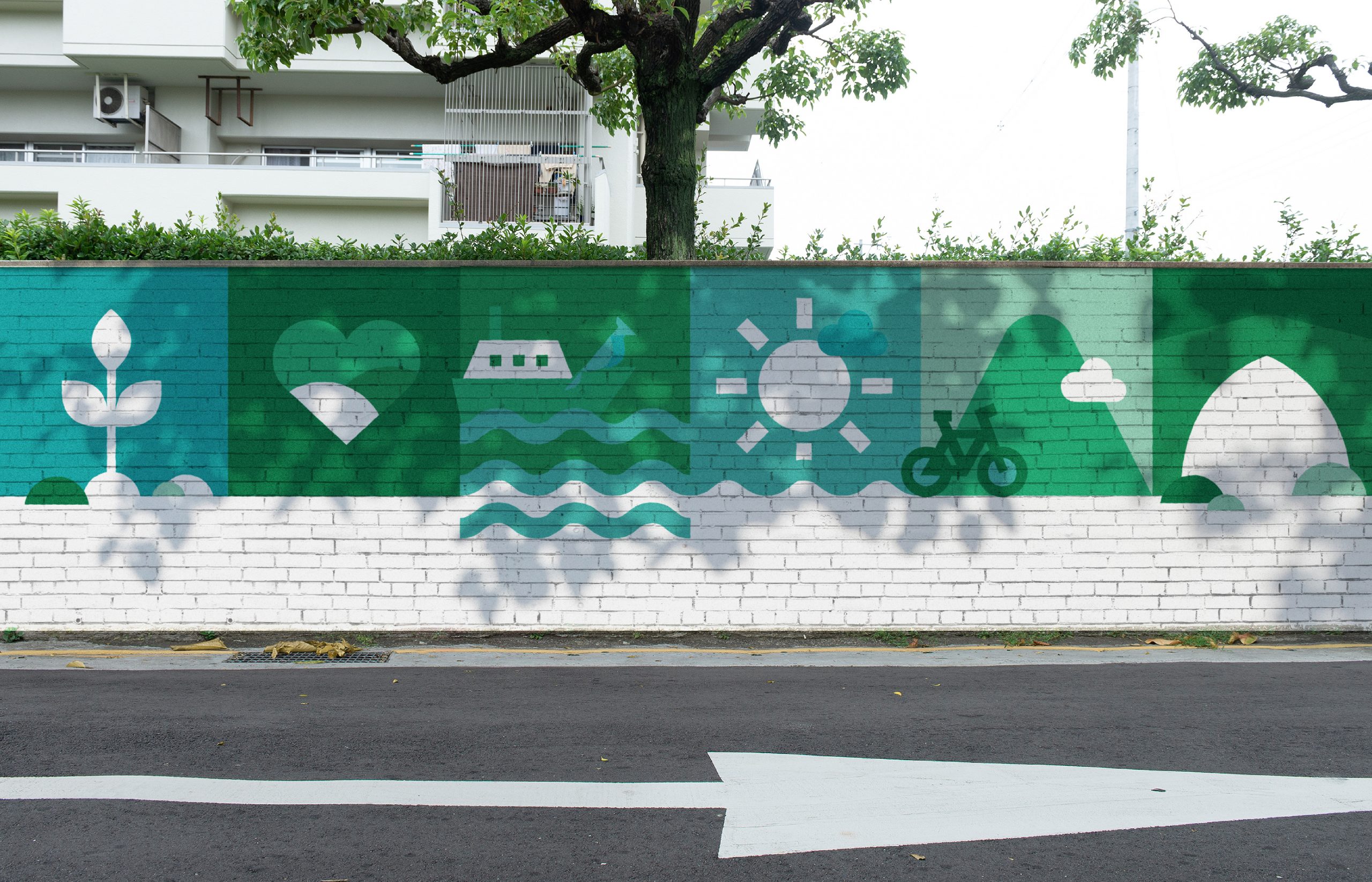
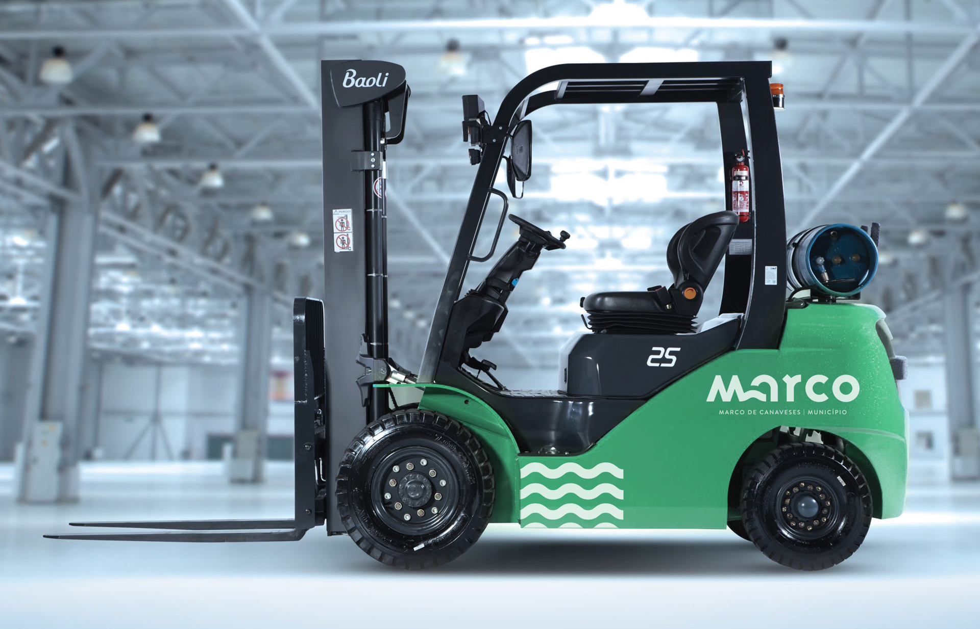
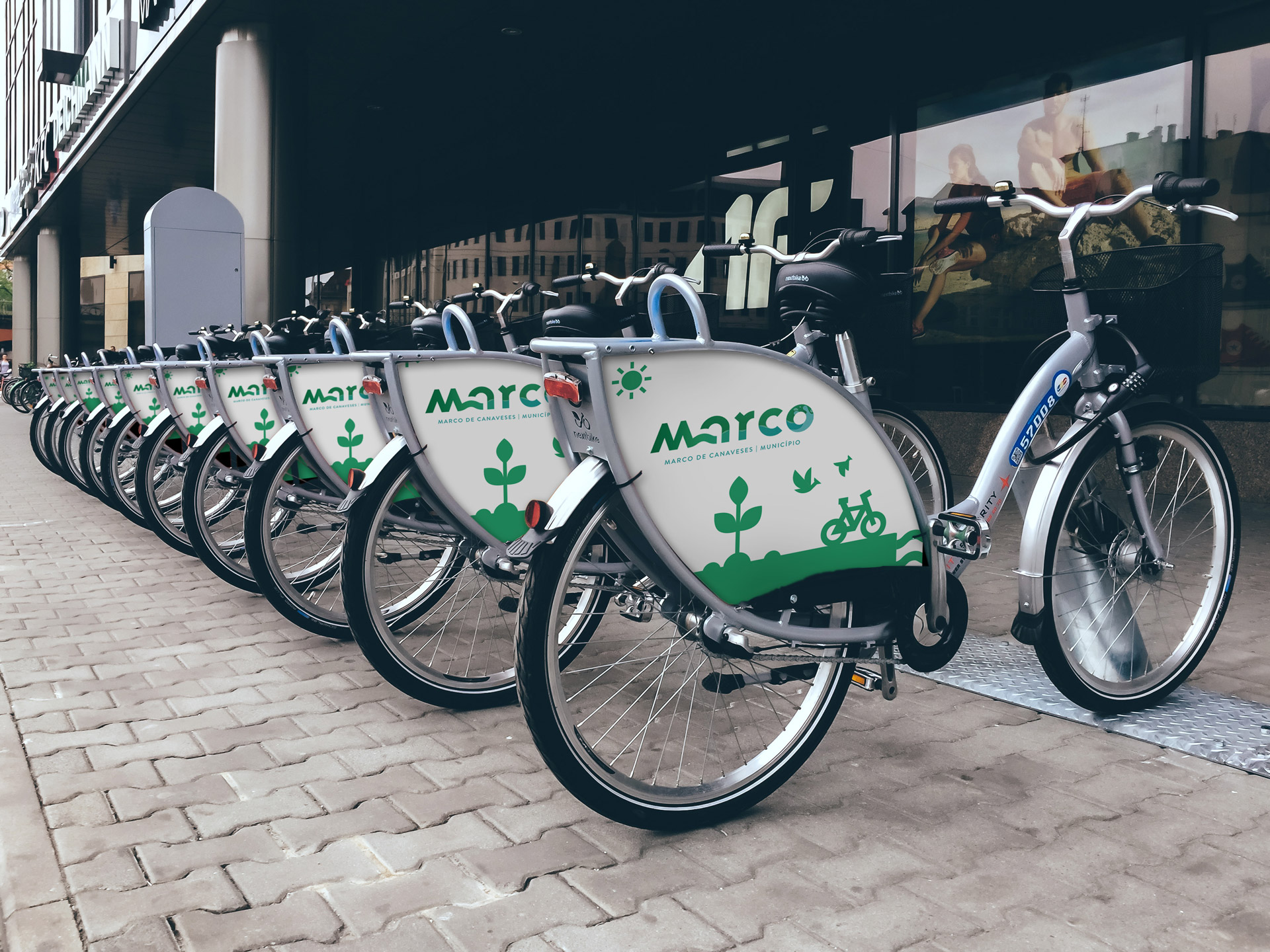
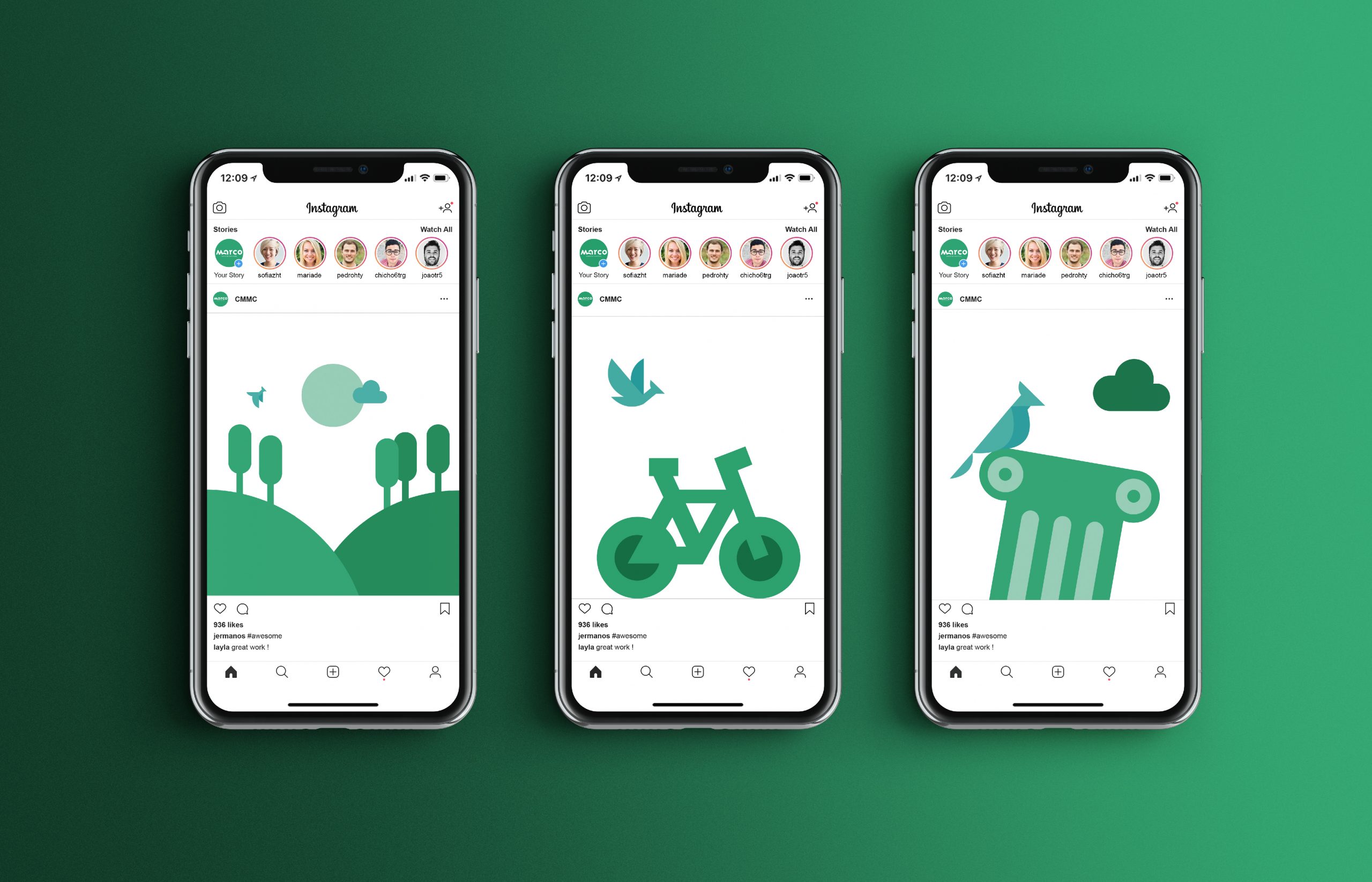
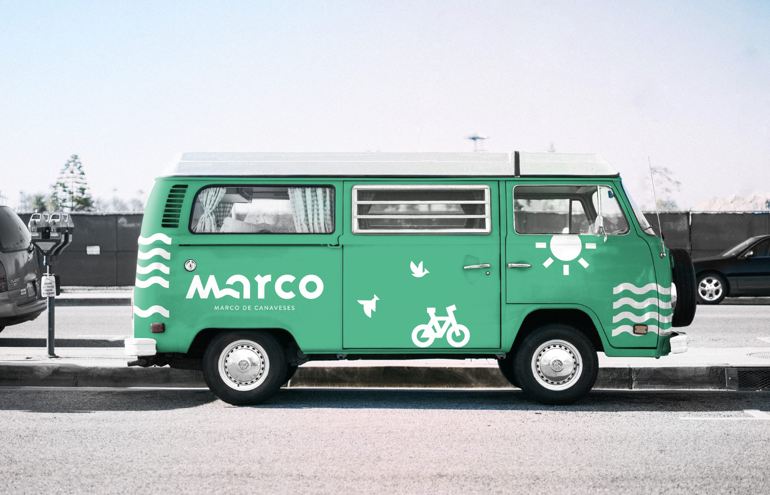
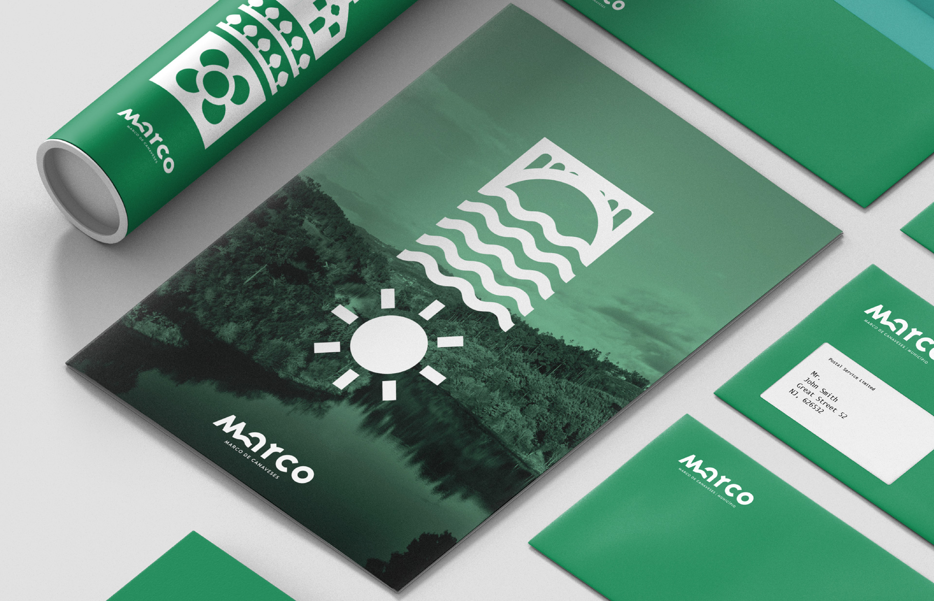
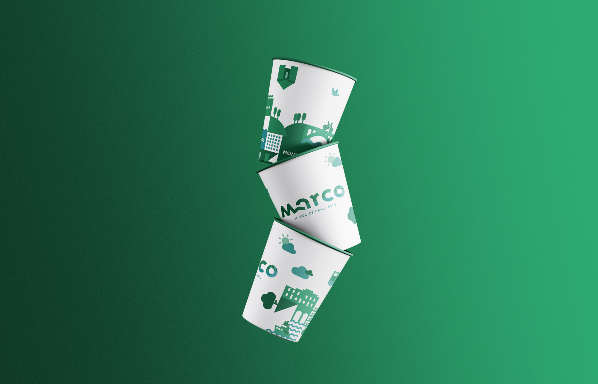
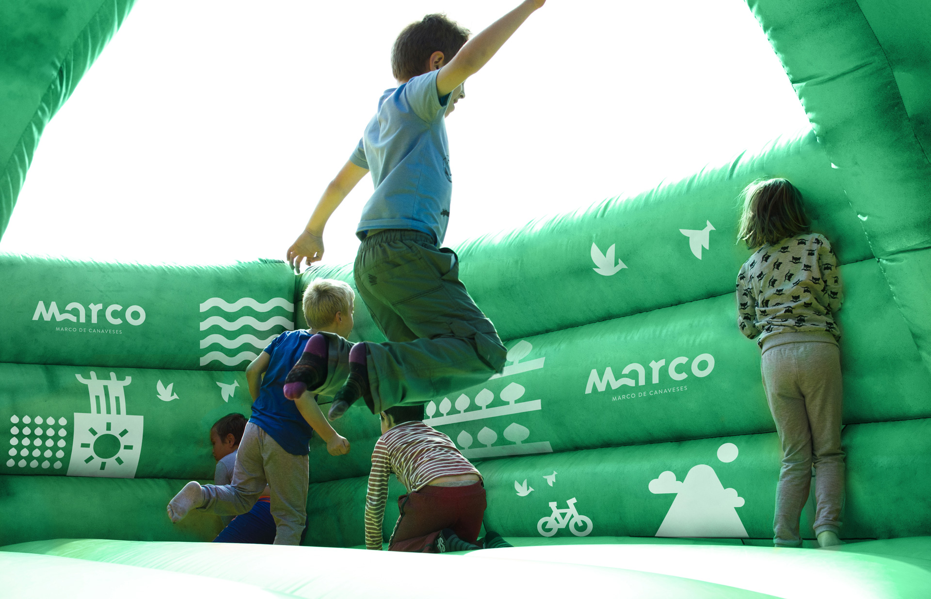
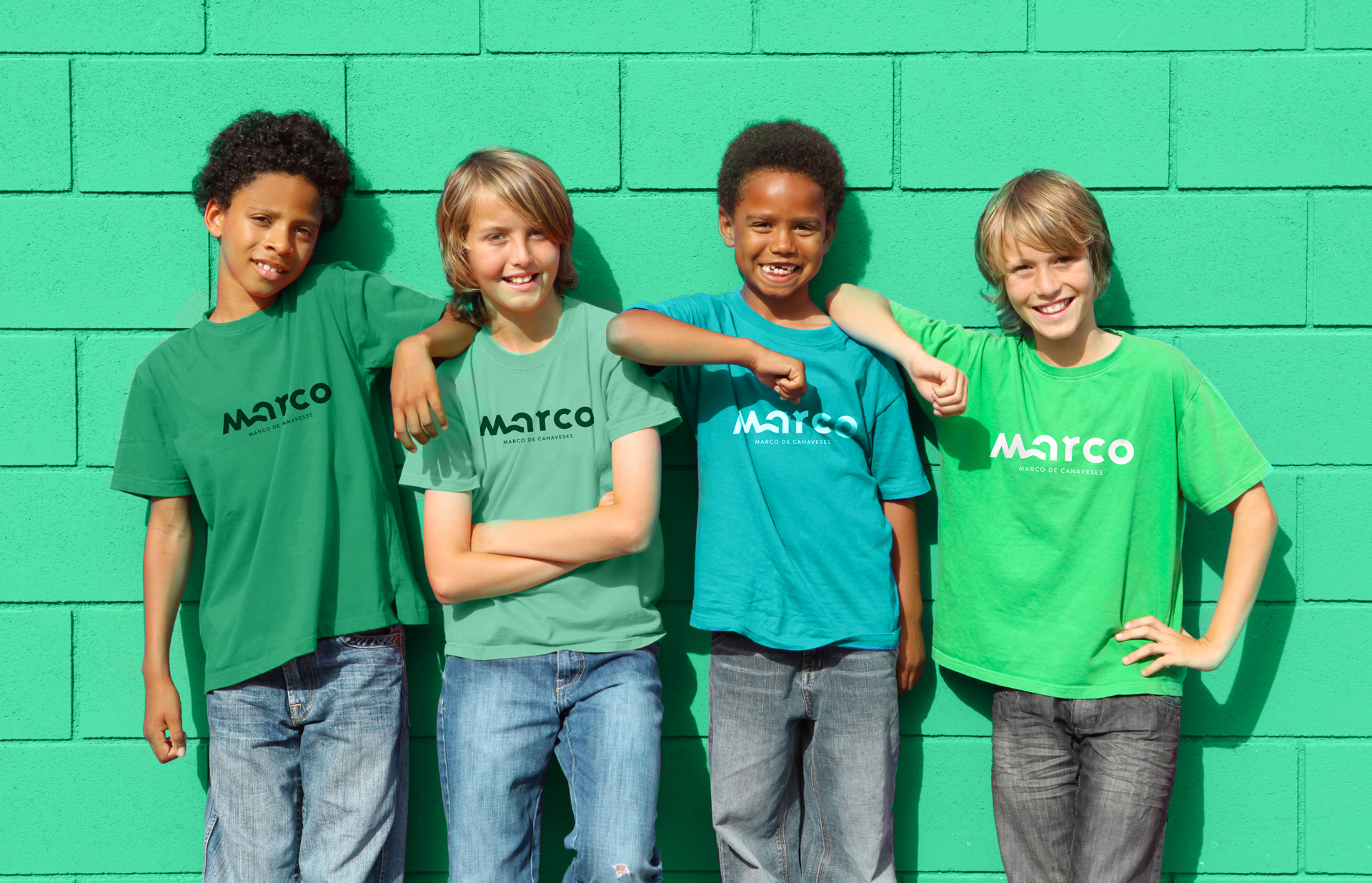
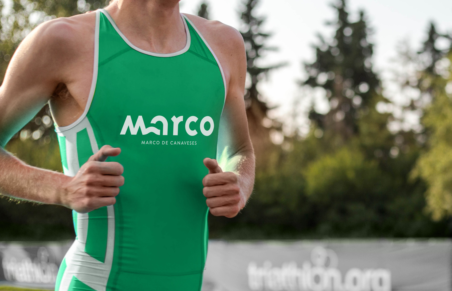
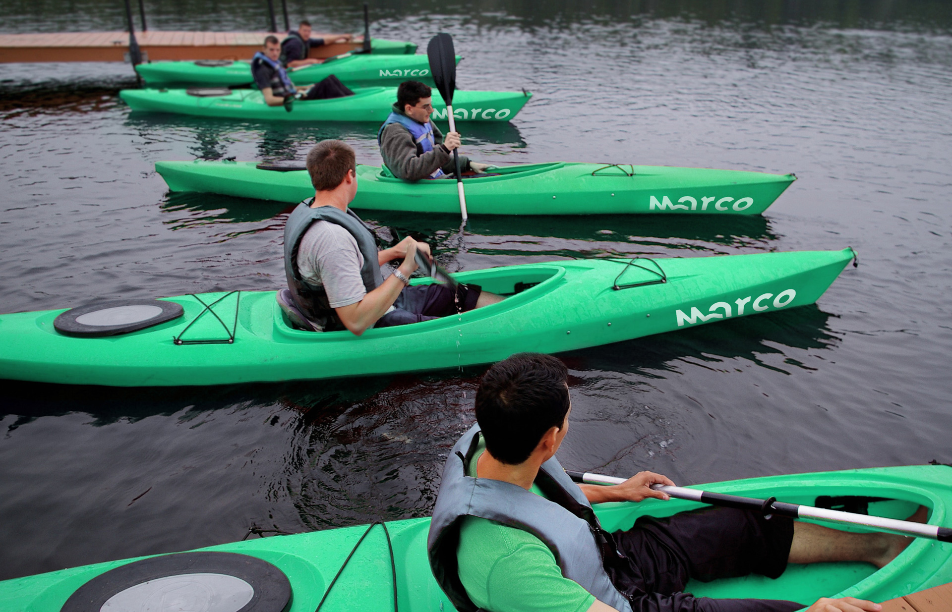
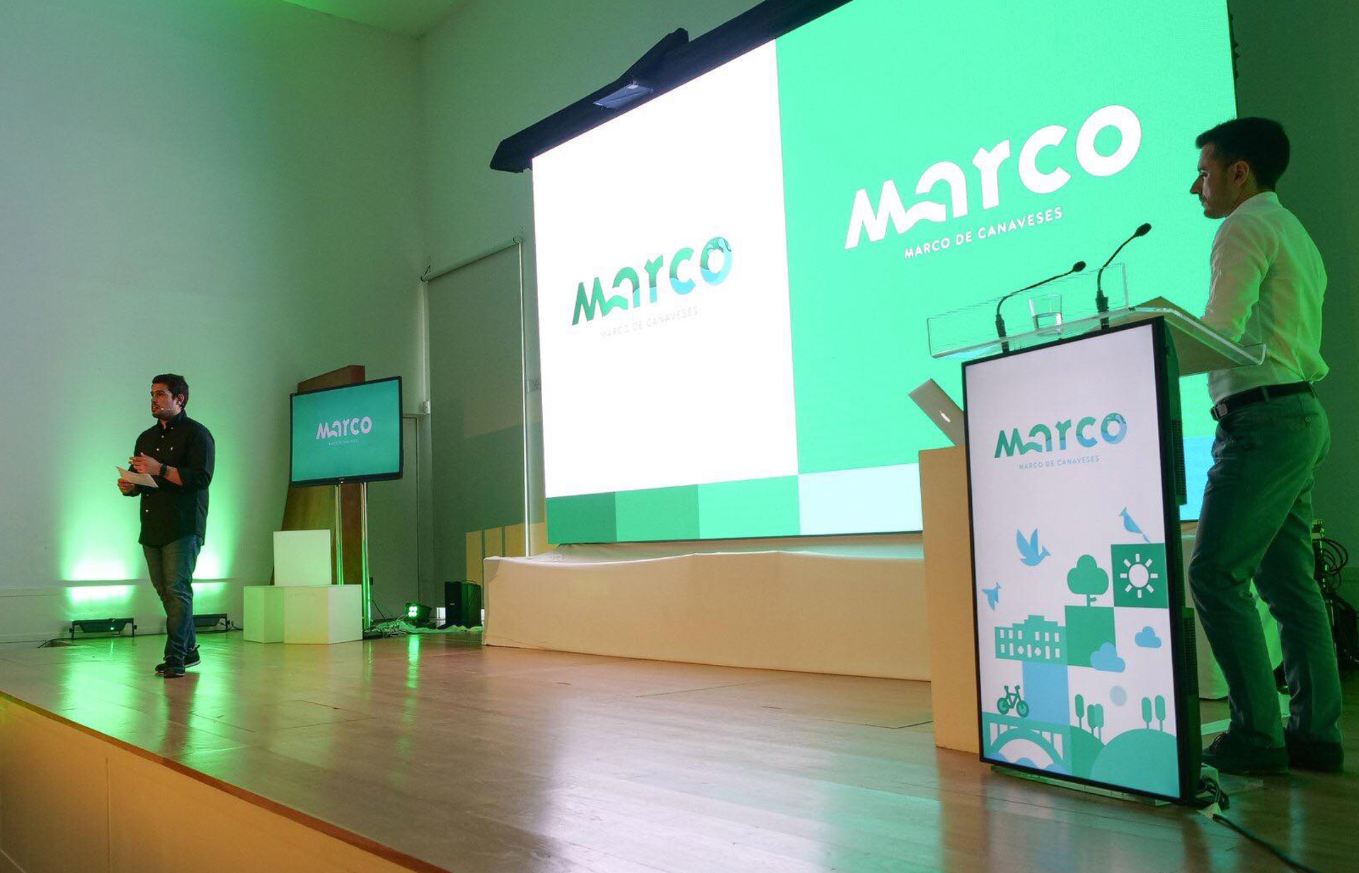
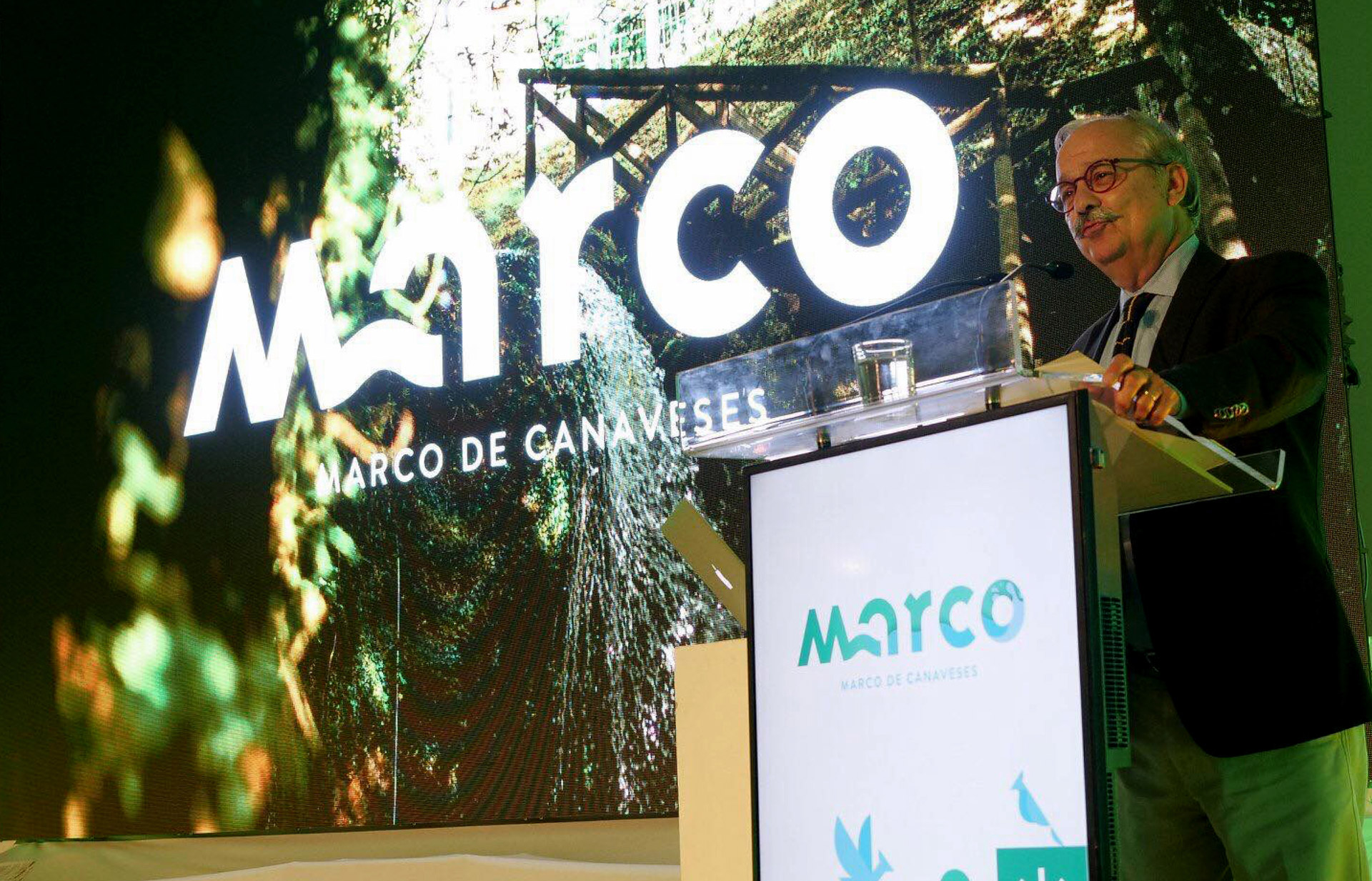
Marco de Canaveses is known only as “Marco” so we embraced it as the generic designation and explored the element represented in the coat of arms over the years: a bridge. We created a modern identity, representative of the landscape and the architecture township, by developing a tight connection between the letters M and A forming a stylised illustration without losing the structural form that allows the reading of the entire word. We chose a colour palette that represents the rivers and the nature and applied it to the iconographic elementos developed after to help build and empower a timeless and bold brand.
Art Direction & Design: Villae - Creative Studio
Photo & Video: Novva Marketing