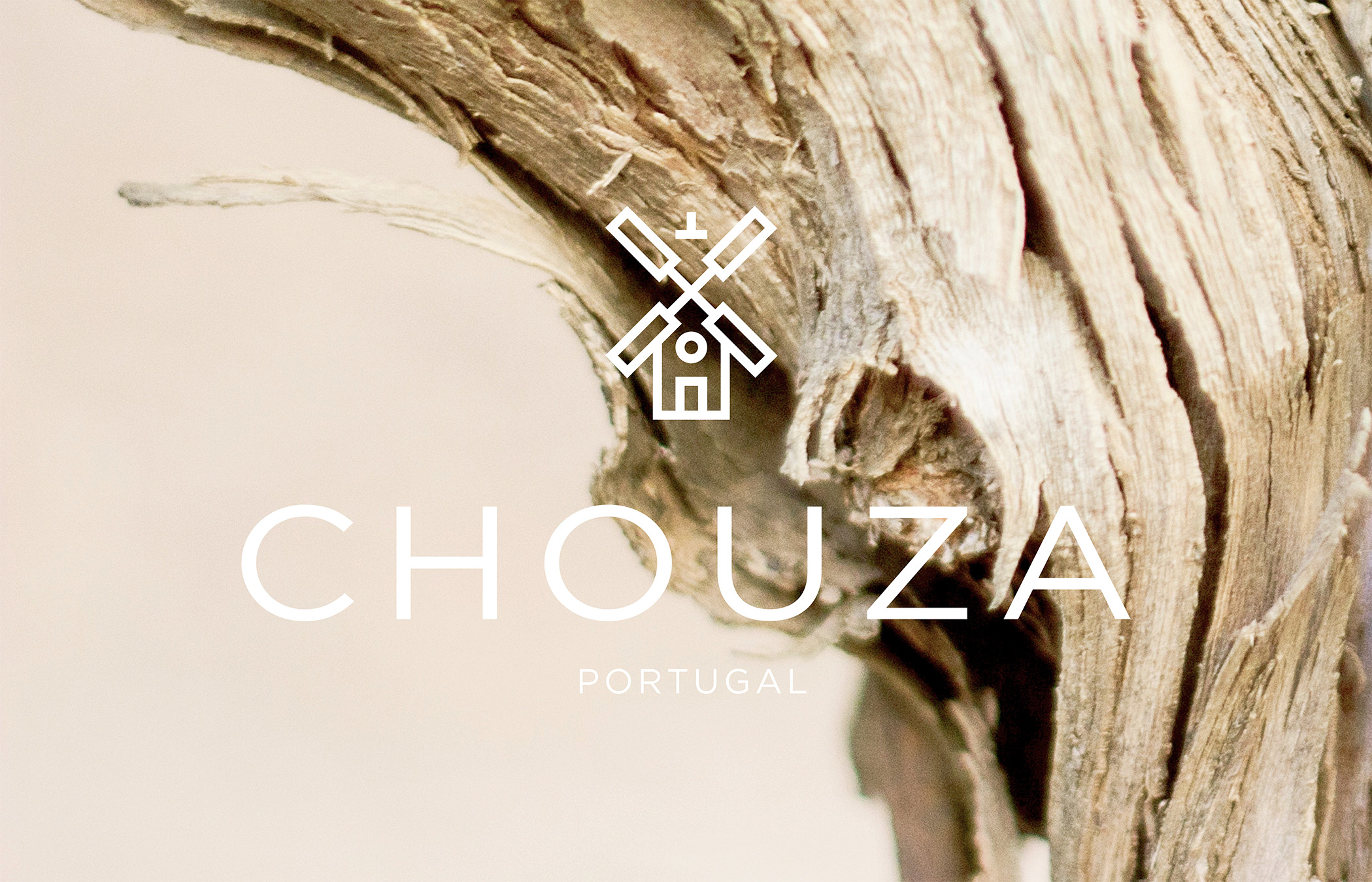
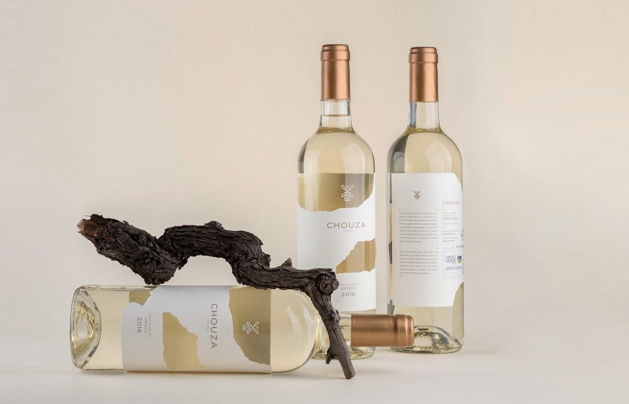
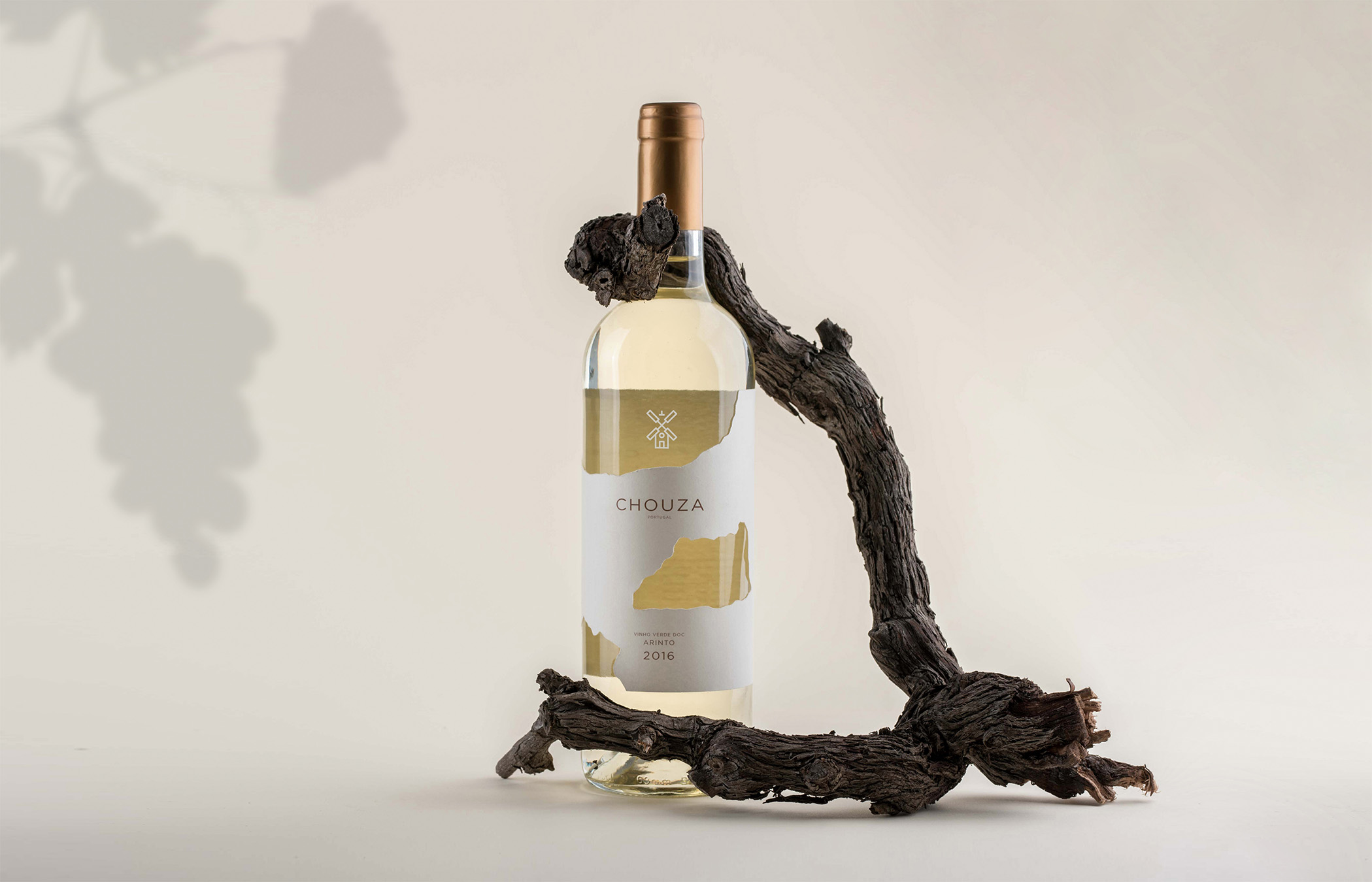
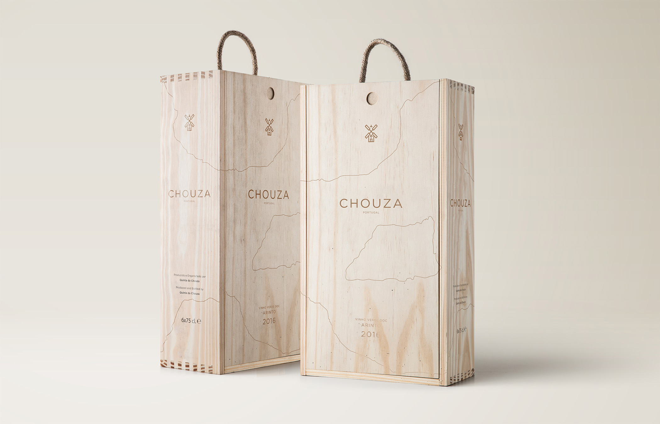
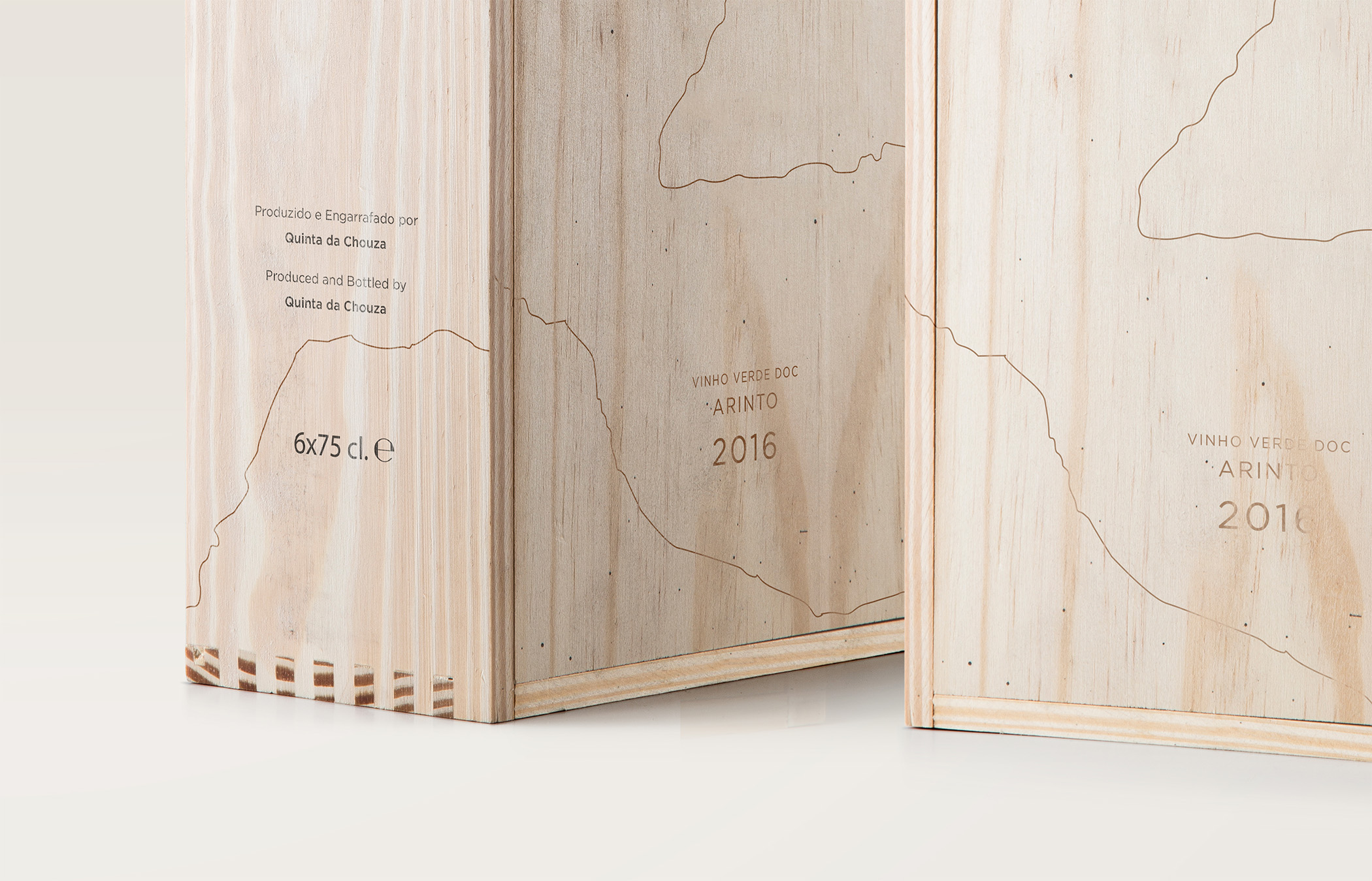
Quinta da Chouza
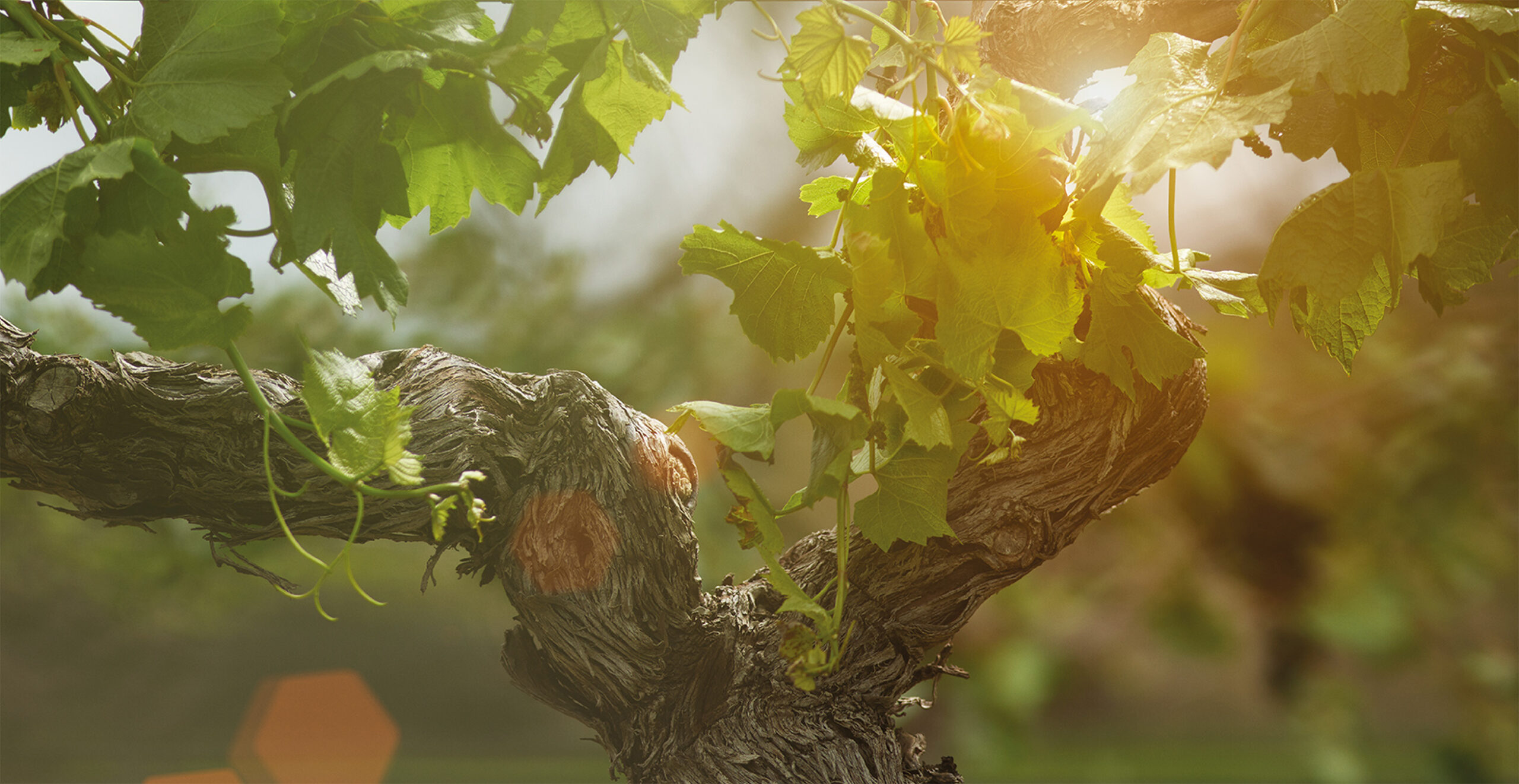
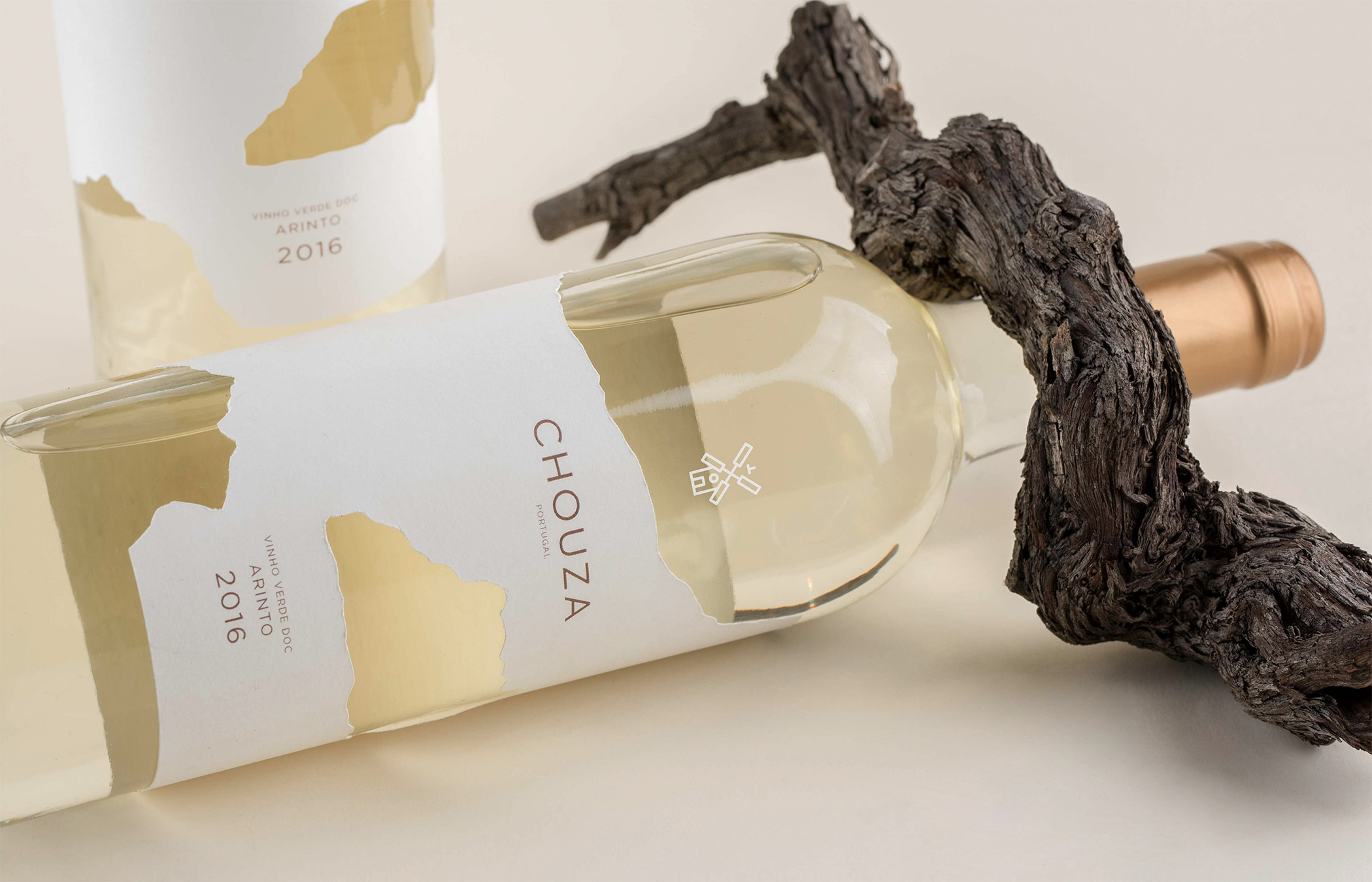
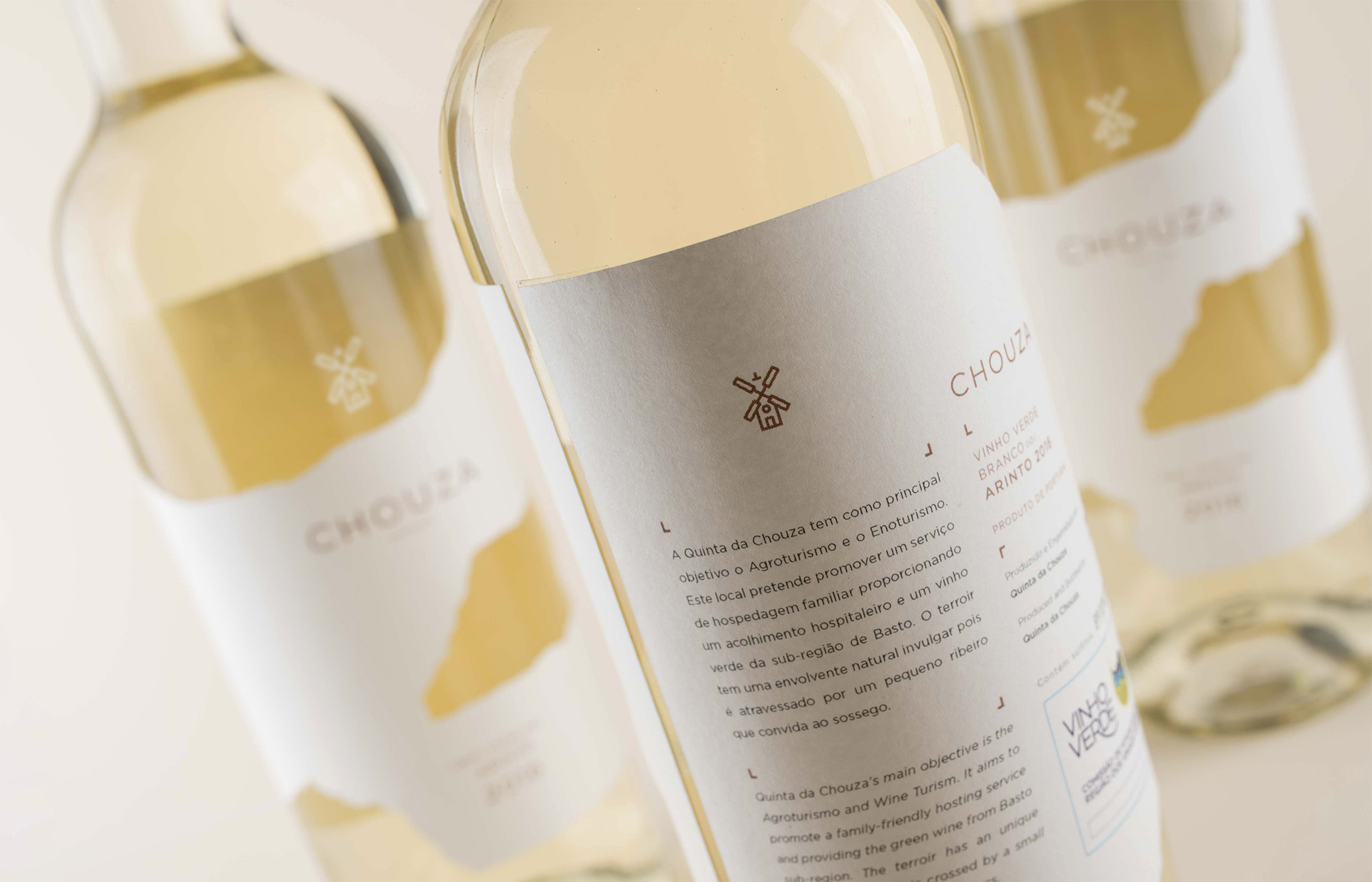
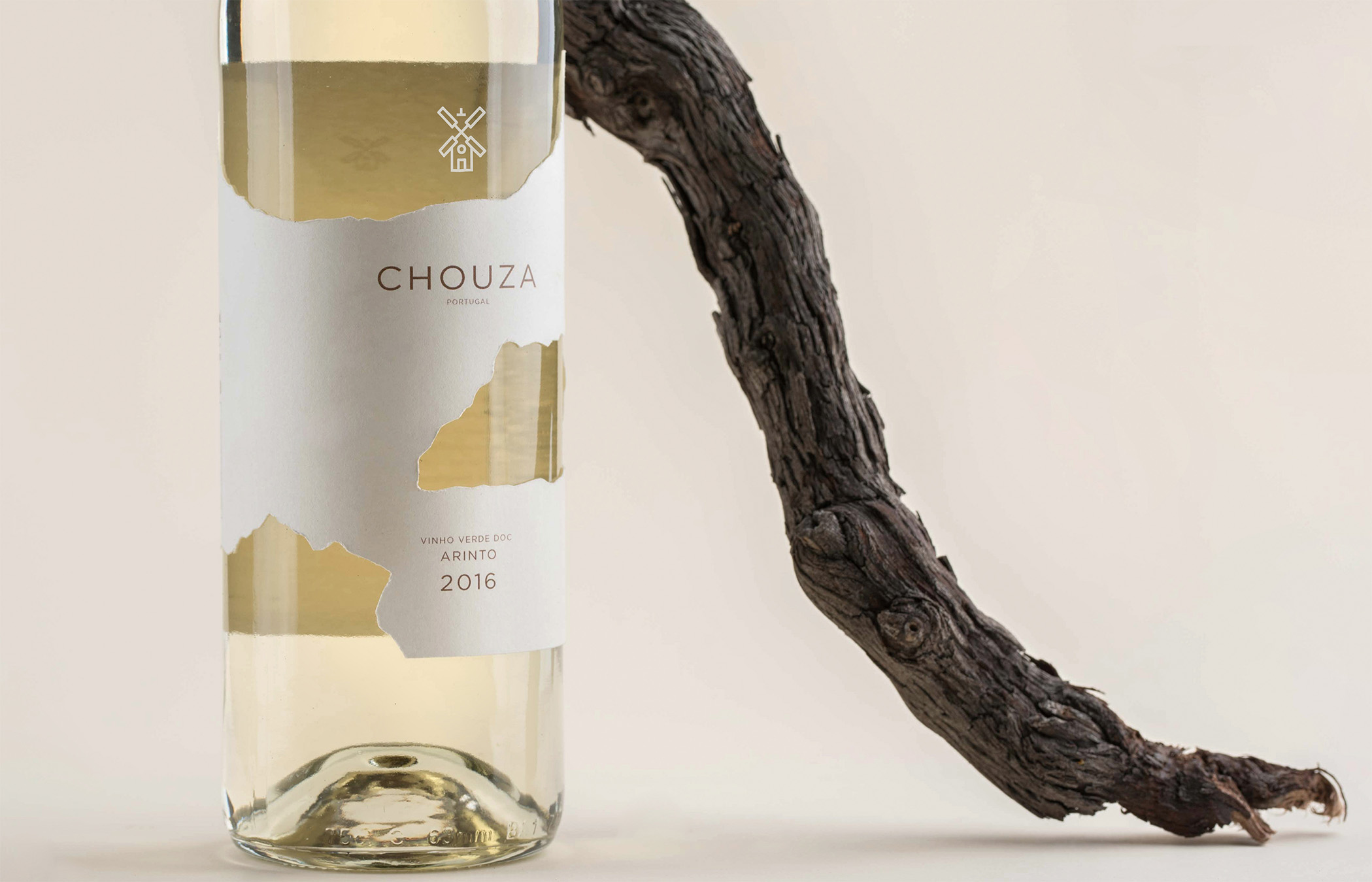
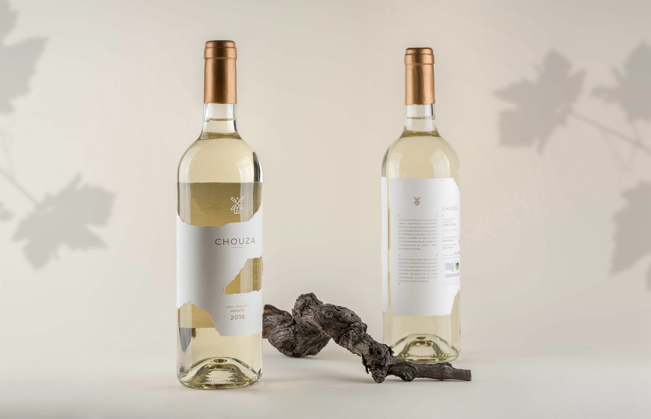
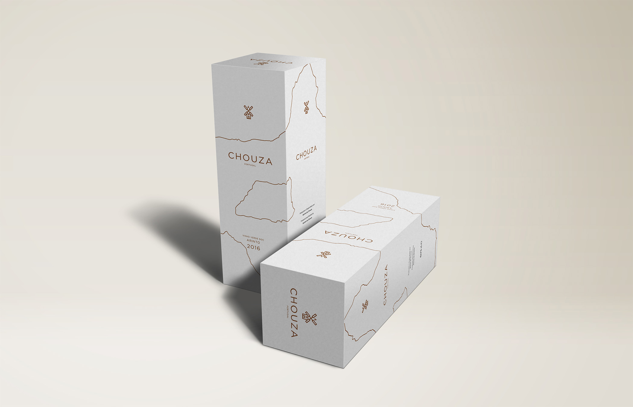
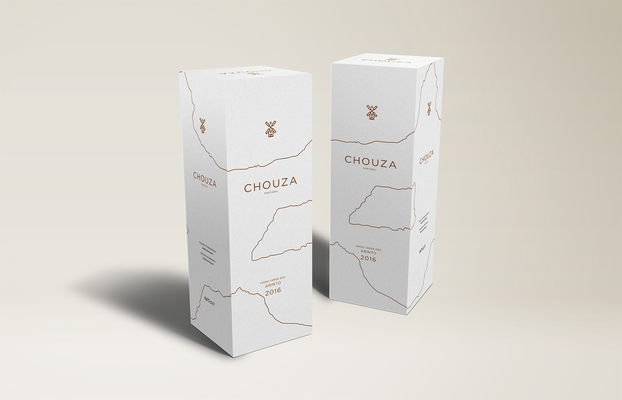
Quinta da Chouza is a wine farm characterised by its small mill and known for the quality of its grapes and green wine. For this project, we created an identity representative of the architecture and natural elements existent in the landscape. Therefore, we projected a mill, a symbol inside of its grounds. The final result is composed by a thick line and minimal illustration as the central component and is accompanied by a subtle and simple typography with a pronounced space between each letter.
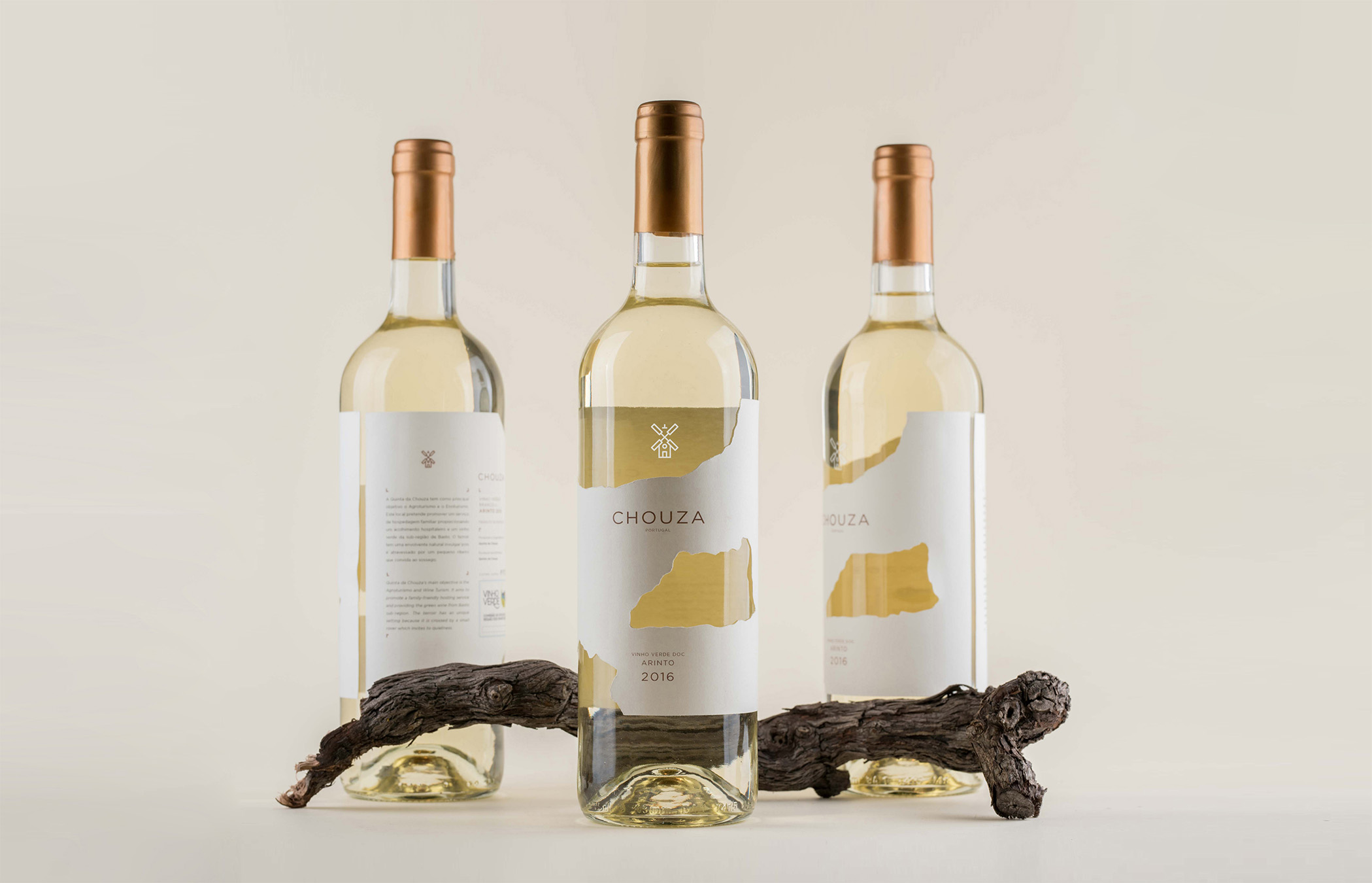
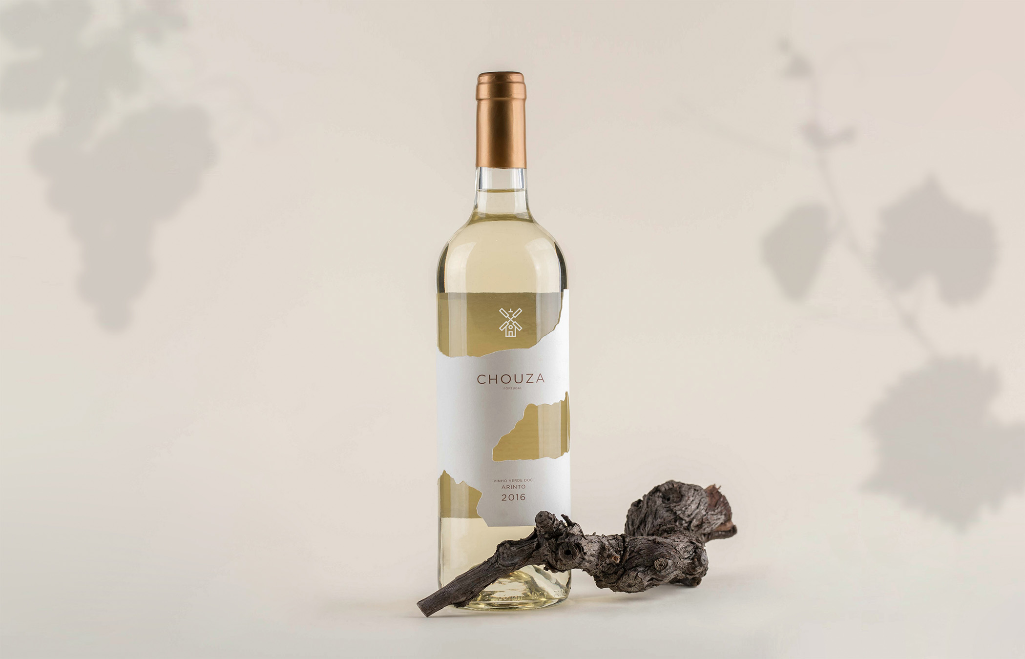
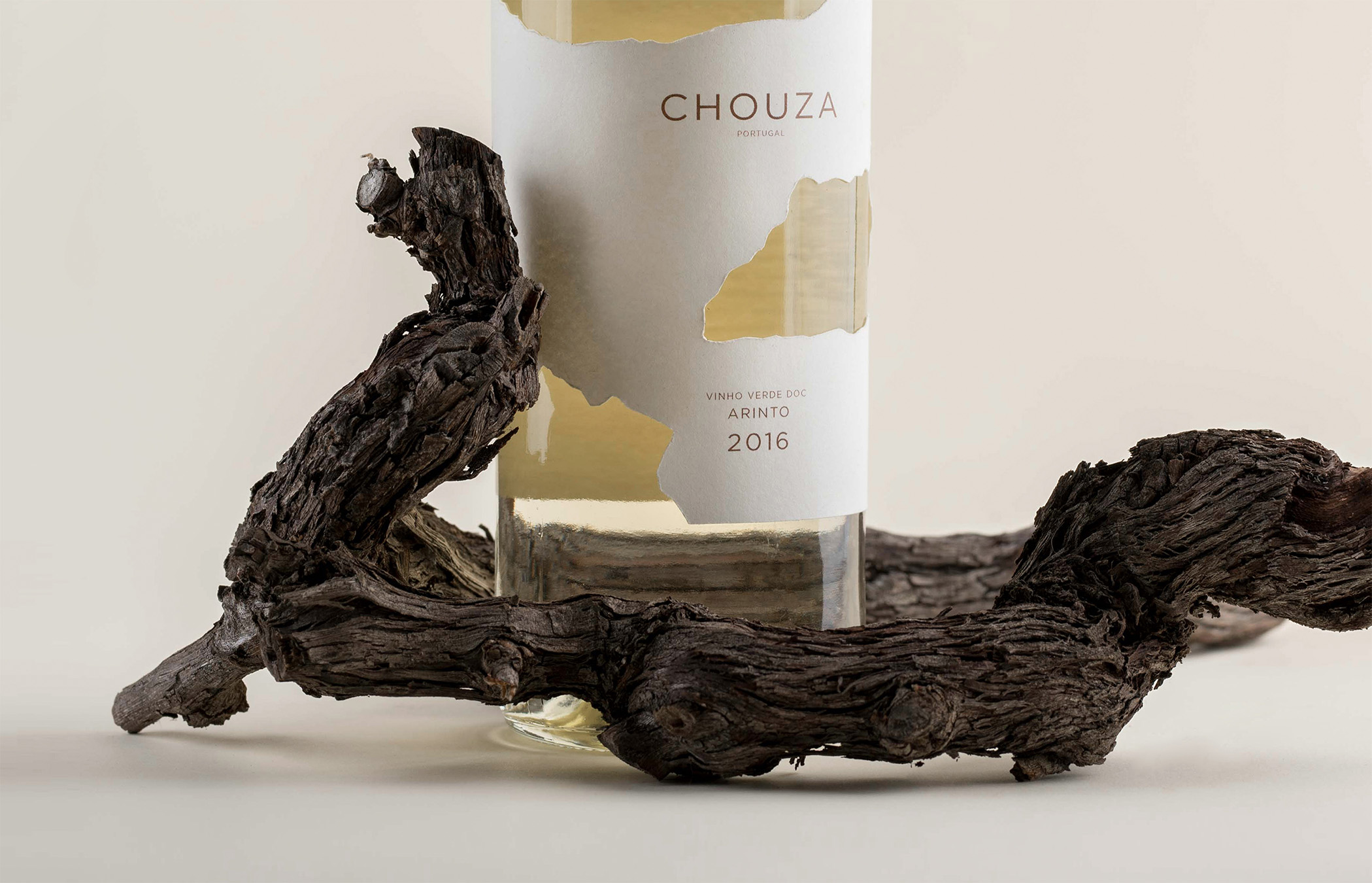
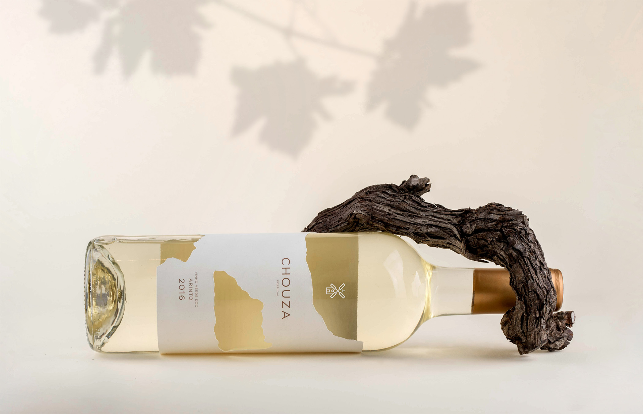
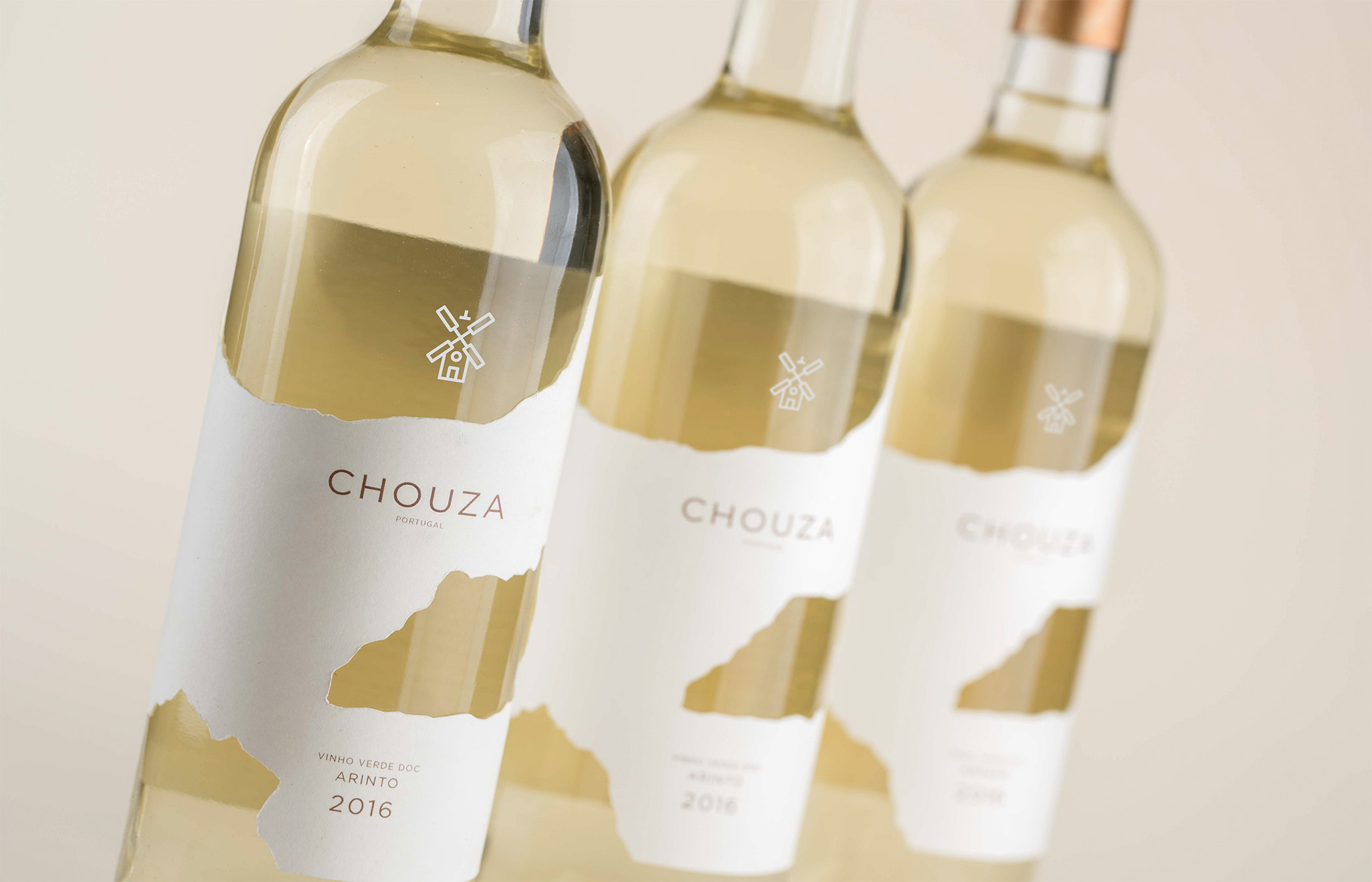
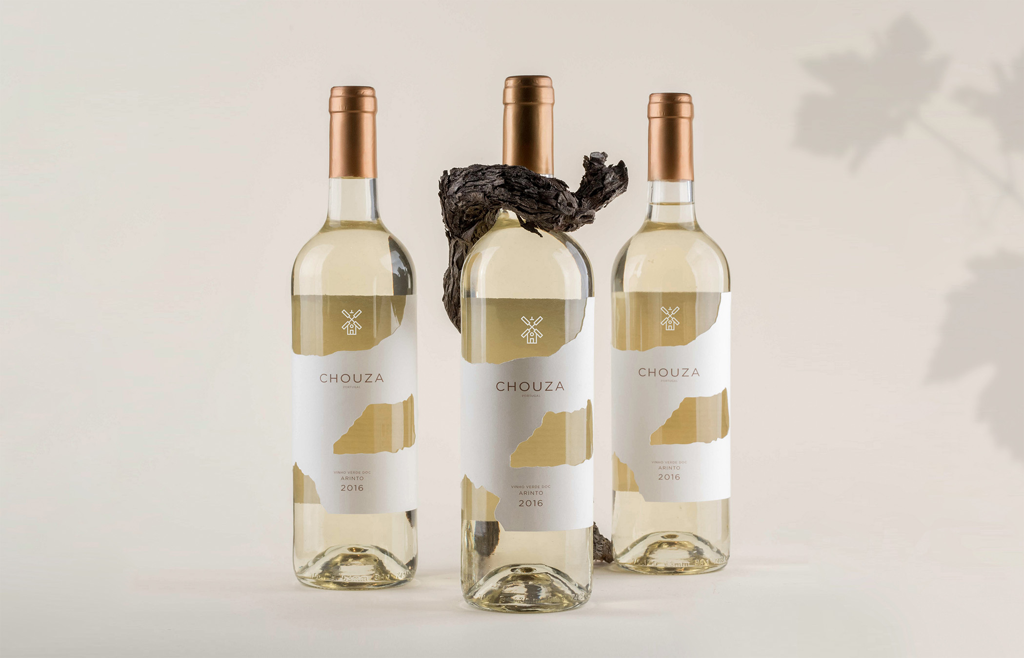
After the identity we proceed to the label’s design, in which we designed a special cut that stands for the roughness of the grounds characterised by the large rocks. This cut also allows us to see the wine color in various angles and stands out in the cream color background of the paper as well as it makes a nice contrast with the bronze lettering and identity surrounding the bottle.
After the identity we proceed to the label’s design, in which we designed a special cut that stands for the roughness of the grounds characterised by the large rocks. This cut also allows us to see the wine color in various angles and stands out in the cream color background of the paper as well as it makes a nice contrast with the bronze lettering and identity surrounding the bottle.