Nadir Afonso
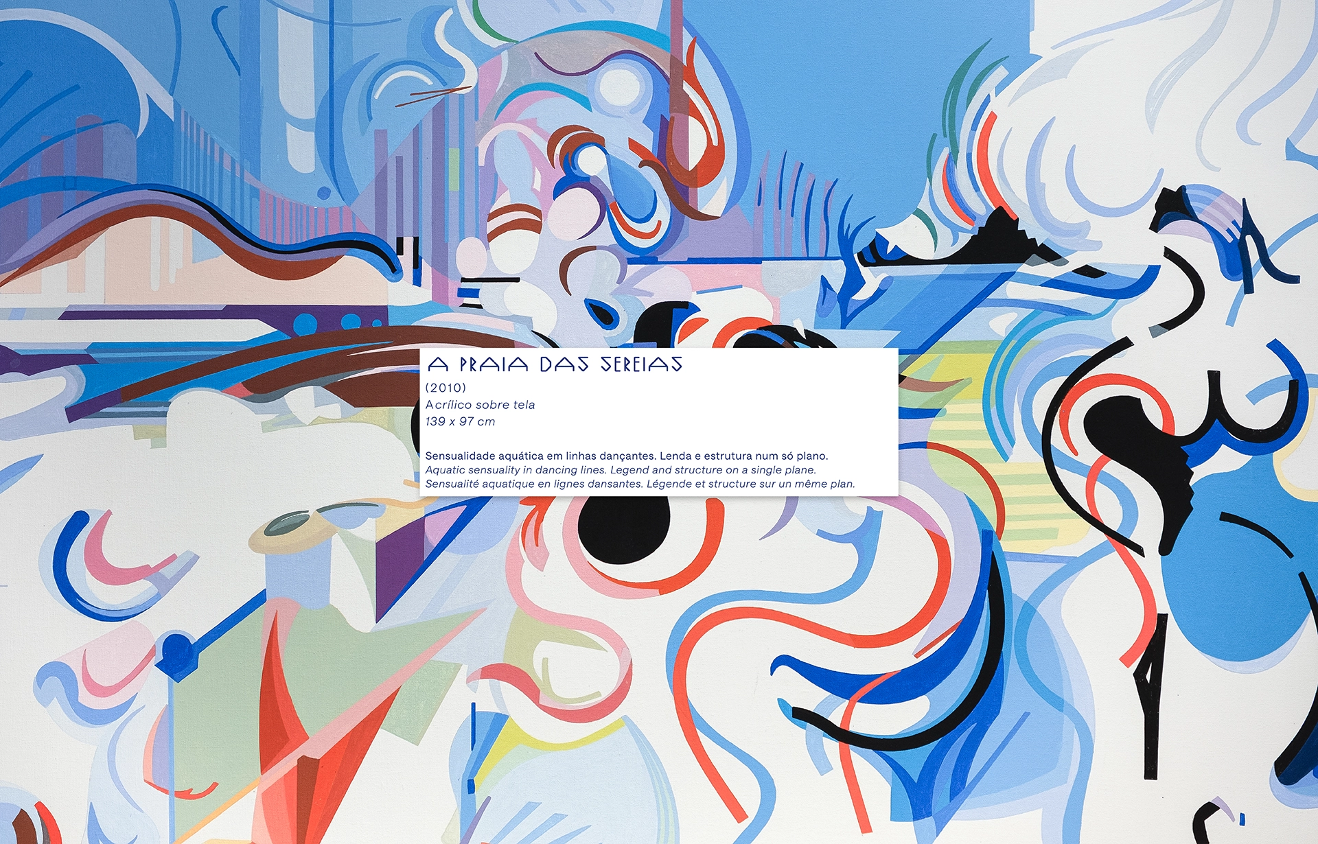
An unmistakable figure of 20th century Portuguese art, Nadir Afonso stood out for the unique way he crossed painting, architecture and mathematics. His work developed around geometry, color and the search for an aesthetic order, central to his artistic language.
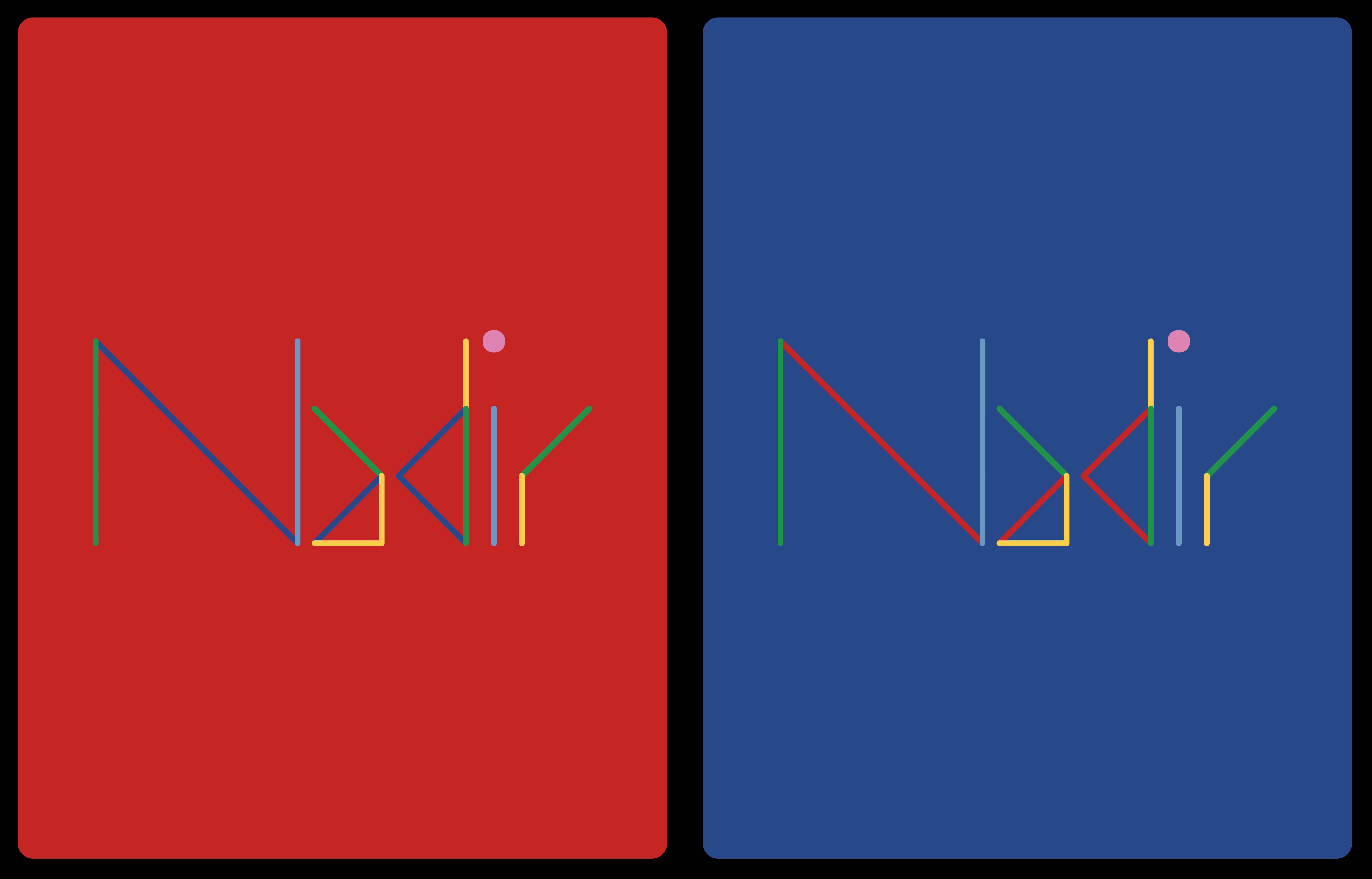
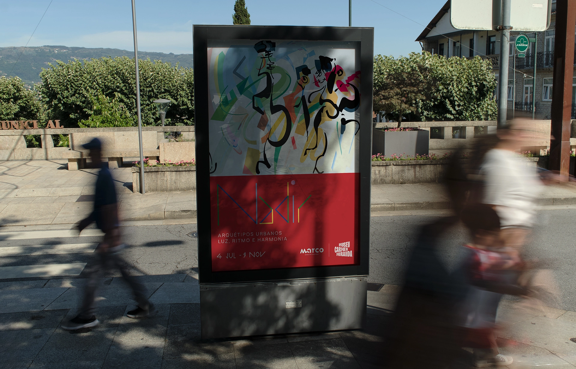
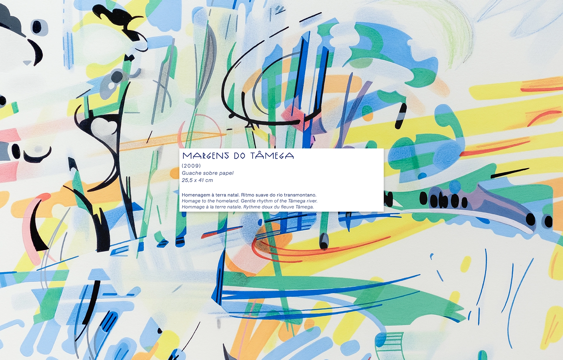
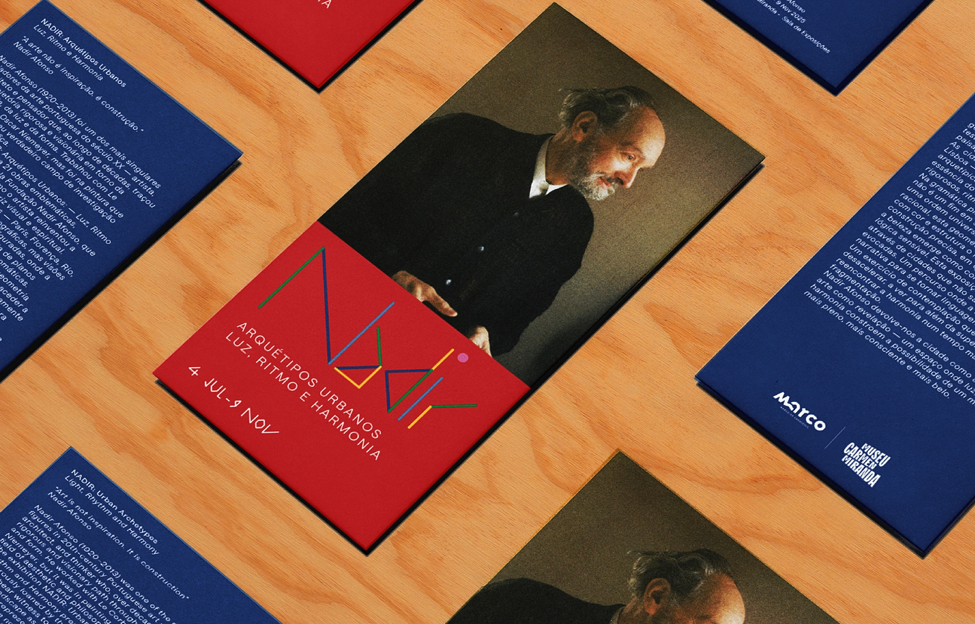
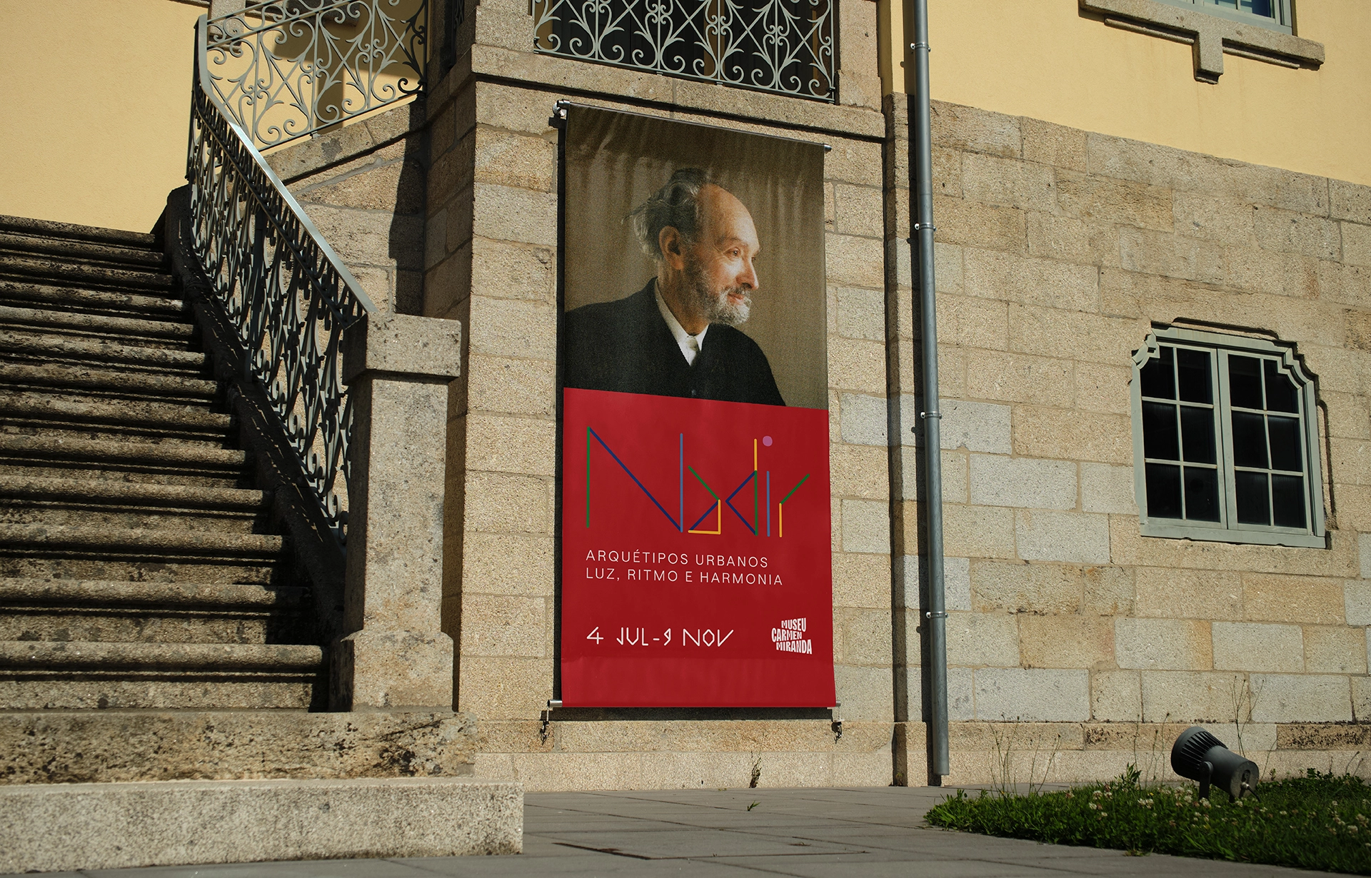
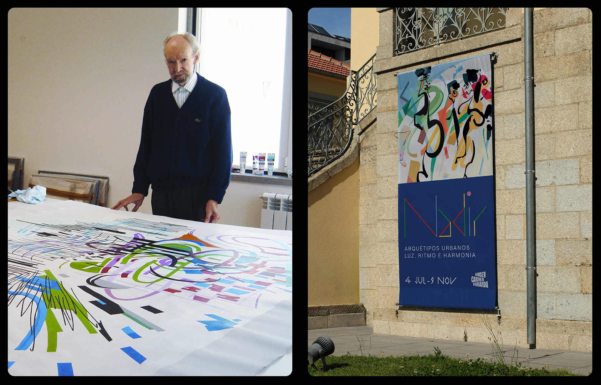
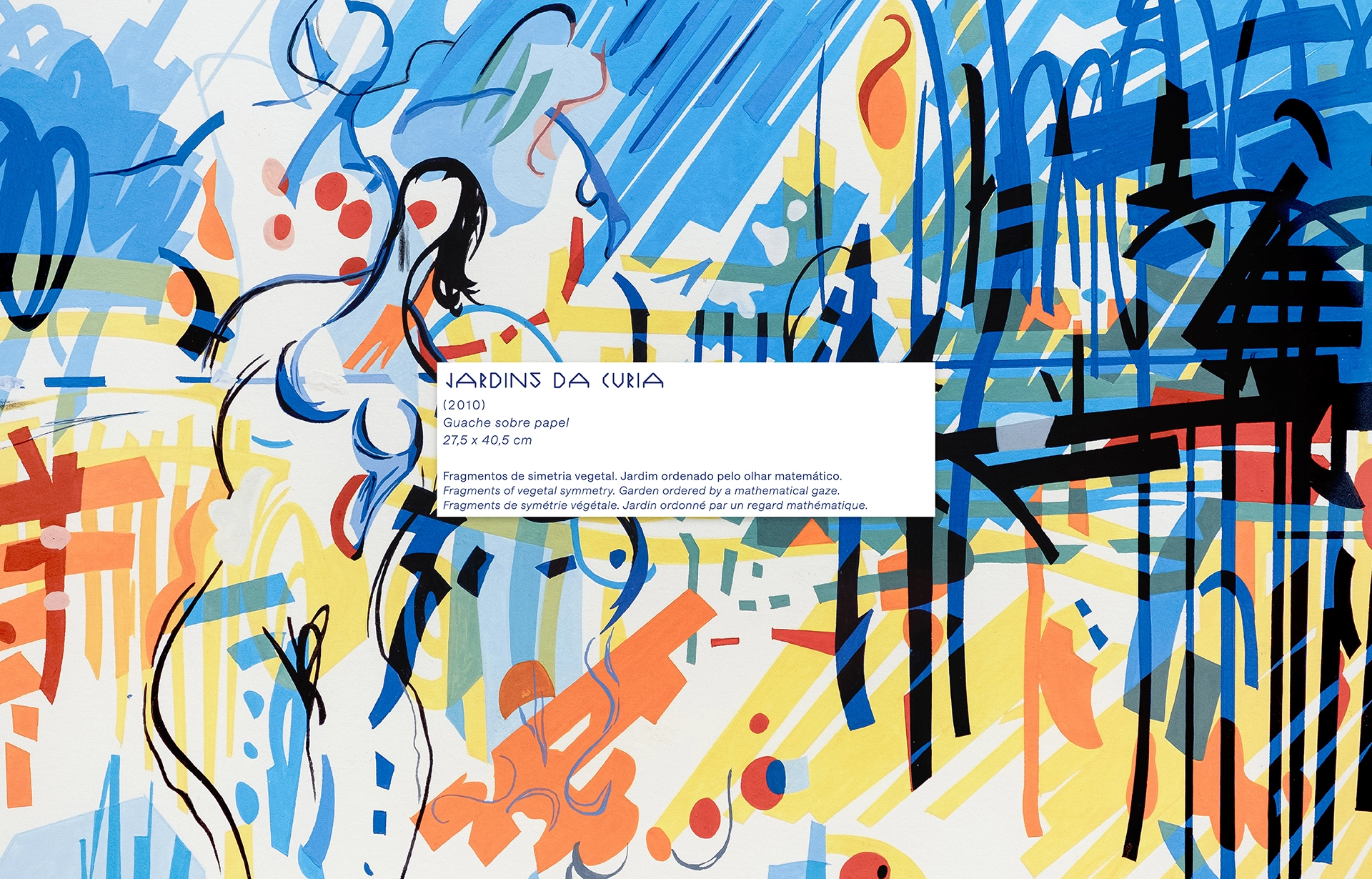
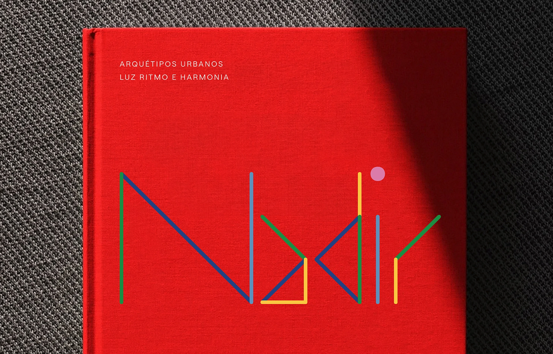
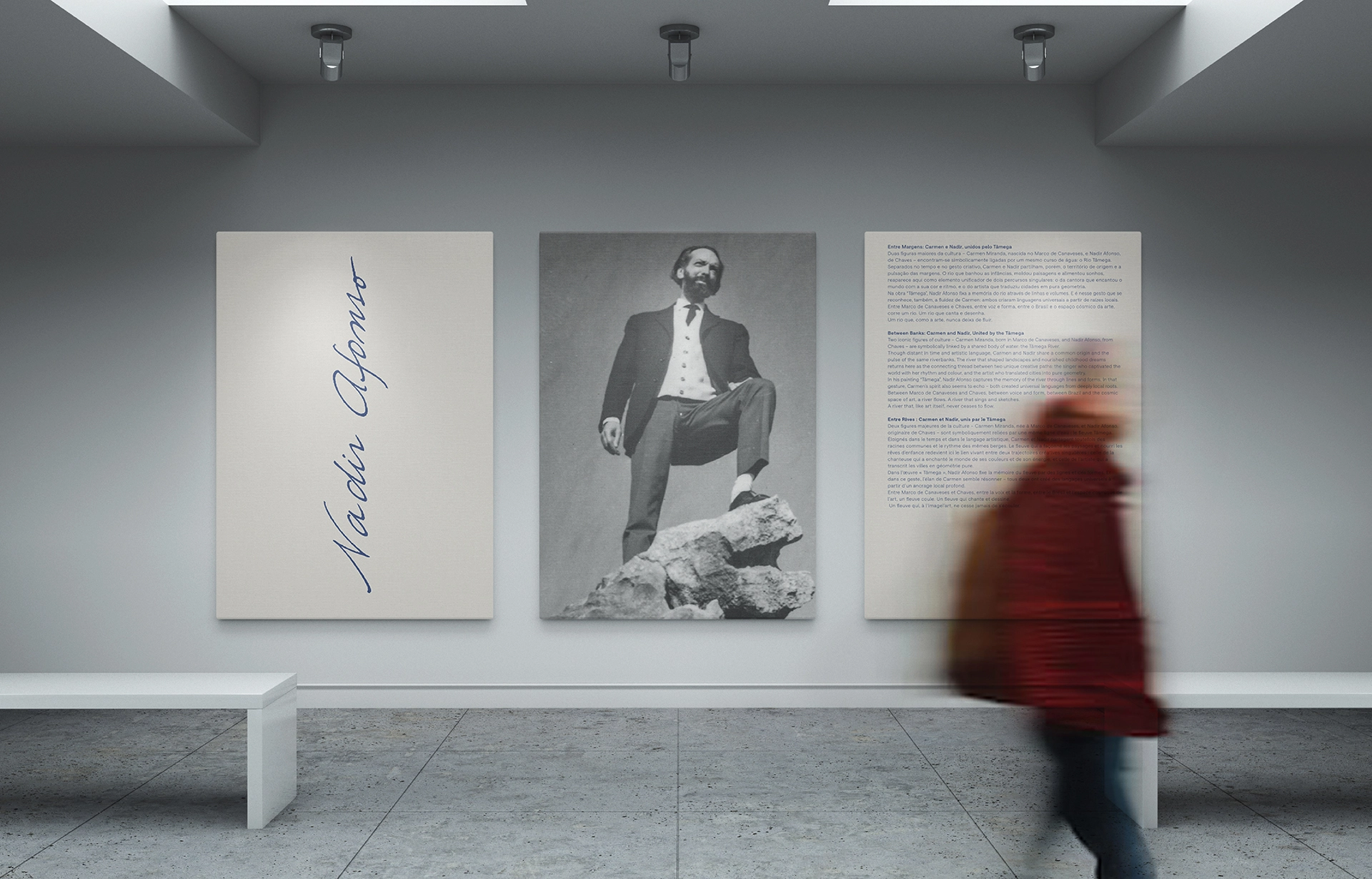
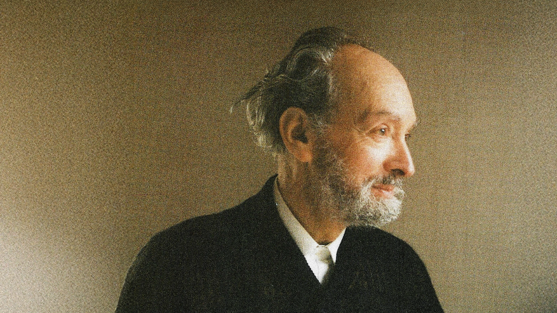
Starting from this visual universe, we developed the identity of the exhibition from a geometric typography inspired by the artist’s compositions, its expressive lines and the use of vibrant colors. The name Nadir, designed specifically for this project, assumes itself as the main element of communication, complemented by two chromatic spots, blue and red, and by the artist’s photograph, giving personality and coherence to all supports. The identity was applied in different communication materials, from mupis, room sheets, canvas for the facade and captions of the works, creating a consistent visual system and easily recognizable.
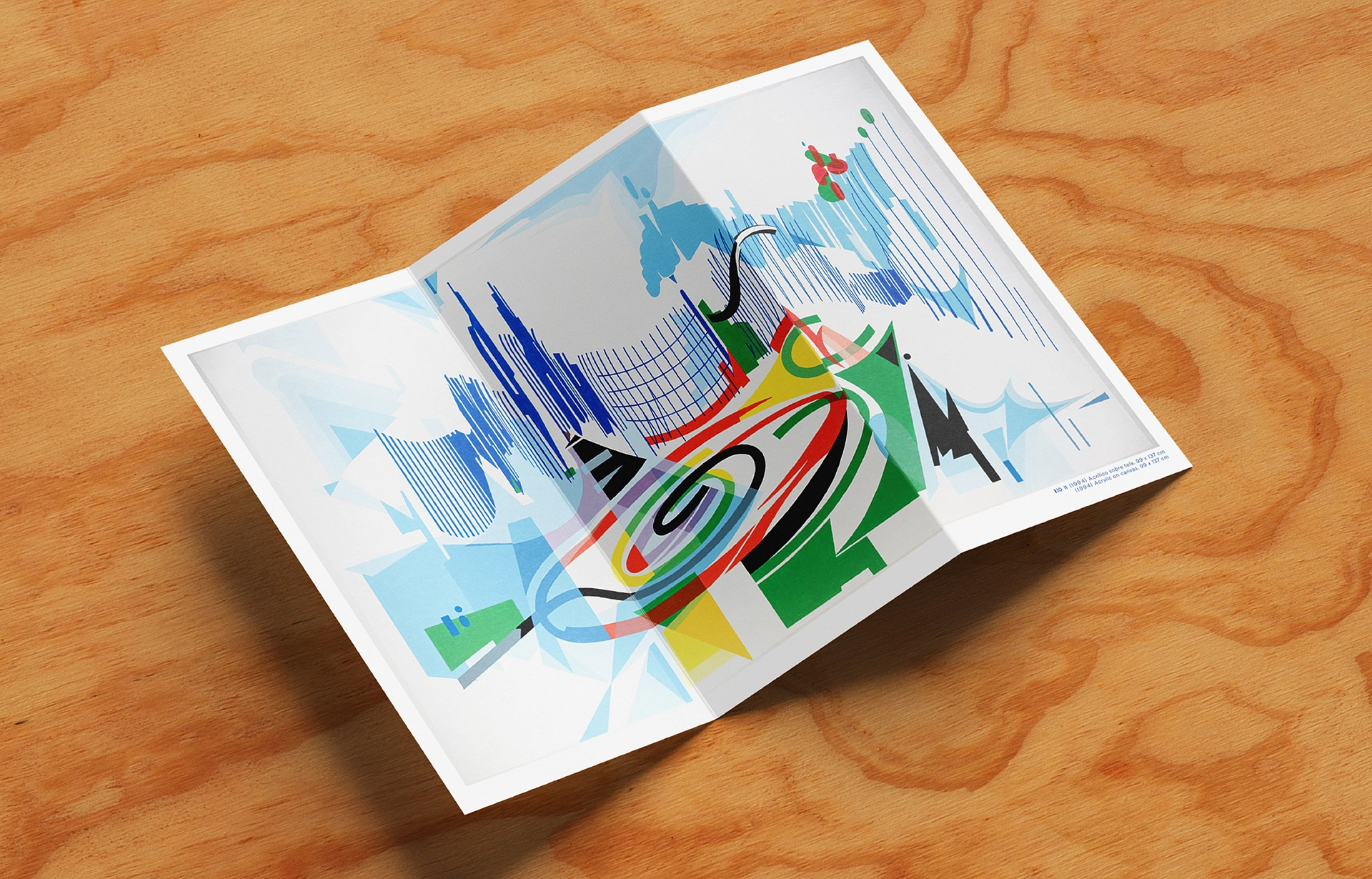
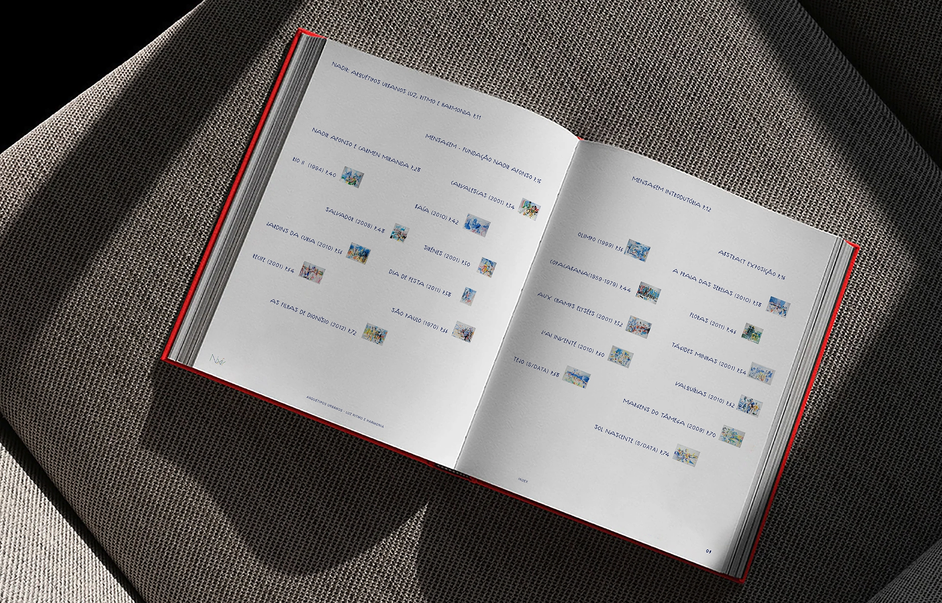
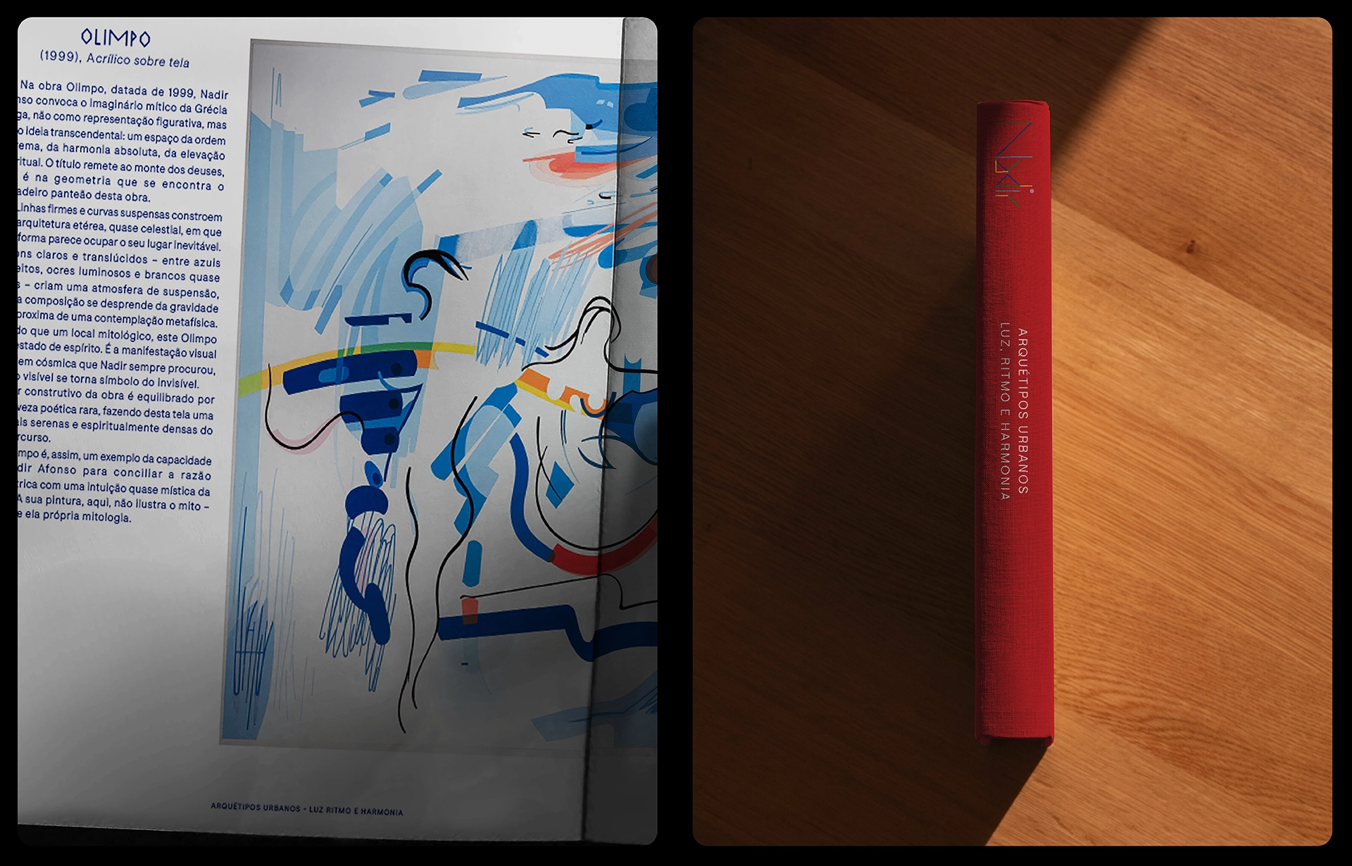
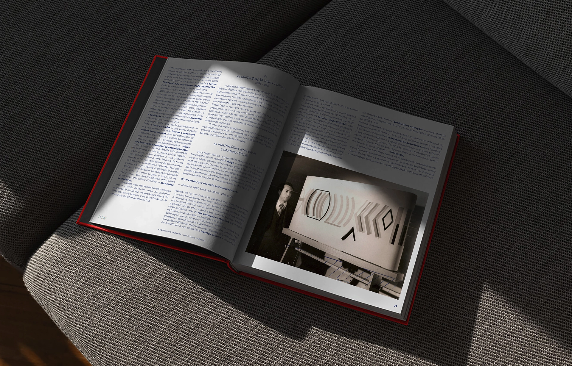
At the same time, a catalog was developed with a contemporary editorial approach, where the main objective was to enhance the exhibited works. Through different graphic compositions, it was sought to create rhythm throughout the reading, establishing a constant dialogue between the content and the visual language of Nadir Afonso.
Art Direction & Design : Villae Studio
Partner : Fundação Nadir Afonso
Starting from this visual universe, we developed the identity of the exhibition from a geometric typography inspired by the artist’s compositions, its expressive lines and the use of vibrant colors. The name Nadir, designed specifically for this project, assumes itself as the main element of communication, complemented by two chromatic spots, blue and red, and by the artist’s photograph, giving personality and coherence to all supports. The identity was applied in different communication materials, from mupis, room sheets, canvas for the facade and captions of the works, creating a consistent visual system and easily recognizable.
At the same time, a catalog was developed with a contemporary editorial approach, where the main objective was to enhance the exhibited works. Through different graphic compositions, it was sought to create rhythm throughout the reading, establishing a constant dialogue between the content and the visual language of Nadir Afonso.
Art Direction & Design : Villae Studio
Partner : Fundação Nadir Afonso